Chapter 13: Statistics: From Data to Defensible Decisions
A sample mean has standard error 2 at (n=100). To make that standard error 1, doubling the sample is not enough. Because precision improves with the square root of sample size, the new target requires about (n=400). That small calculation captures both the power and the frustration of statistics: information has a price, and the price is often quadratic.
Yet sample size is only one part of defensible evidence. A narrow interval from clustered observations may be fiction. A significant result found after repeated peeking may be an accident of the stopping rule. A clean model score may hide collinearity, influential cases, or a search over too many alternatives. Statistical arithmetic becomes trustworthy only when it remains attached to the design that produced the data.
The forty-nine rules in this chapter form three layers. The first plans and communicates precision. The second chooses robust summaries and designs that preserve effective information. The third guards claims against multiplicity, sparse data, model selection, and fragile diagnostics.
The governing habit is: identify the estimand, the effective information, and the decision rule before interpreting a number.
13.1: Precision Before Significance
Precision rules answer a practical question before a significance threshold does: how much uncertainty surrounds the quantity that matters? These thirteen profiles connect standard errors, confidence intervals, power, correlation screening, and sample-size planning while keeping their sampling assumptions visible.
13.1.1: Standard Error of a Mean
History
How far can a single average drift from the truth, when the population’s own spread is unknown in advance? Gosset’s 1908 paper The Probable Error of a Mean, published in London under the name Student, worked through exactly that problem: his measurements had to supply their own estimate of that spread, so the normal distribution’s critical value could not be trusted. He derived the correct sampling distribution instead, later called Student’s (t). The scale below is the calm arithmetic at its center.
The equation
For iid observations with finite variance (^2),
[ SE(X)=, (X)=. ]
The first uses population spread; the second substitutes the sample standard deviation.
How to read it
Standard error measures how far a sample average typically sits from the true average. Here () is the spread of individual measurements (their standard deviation), (n) is how many independent measurements went into the average, and (s) is that spread measured in the sample. It shrinks with the square root of (n), not (n) itself, so halving it takes four times as many measurements.
What this does not tell you: whether the count is really independent, since a shared machine or batch can mean less information than the count suggests.
How to use it
A quality engineer at a bottling line pulls 100 fill-weight measurements from a shift and finds a sample standard deviation of 20 grams. The estimated standard error is
[ (X)===2 ]
grams: the shift average is typically within about 2 grams of the true fill weight. Management wants that tightened to 1 gram. Solving (20/n=1) gives (n=400), since (20/=20/20=1), four times the current sample. The engineer first checks whether those 400 measurements are really independent: back-to-back readings off one filling head share the same short-term drift. If so, a clustered variance estimate, not more raw readings, is the honest fix. This is an Independent rule: under credible sampling assumptions, it directly converts spread and effective sample size into the uncertainty scale of a mean.
13.1.2: Standard Error of a Sample Proportion
History
A confident-looking percentage can hide a poll’s weakest part: what happens near zero or near everyone. Edwin Bidwell Wilson took that weakness seriously in a 1927 paper. The standard approach froze estimated uncertainty at the sample’s own proportion, so a rare or near-unanimous finding could report almost none. Wilson repaired it by inverting the underlying score test, producing an interval that stays between zero and one and widens near those edges: the plug-in error below belongs to the approach he corrected, reliable away from the boundaries but overconfident where a close call matters.
The equation
For (x) successes in (n) independent Bernoulli trials,
[ p=, (p) = . ]
The upper bound follows because (p(1-p)/4), with equality at (p=1/2).
How to read it
A sample proportion, written (p), is the fraction of yes answers or successes in a sample: 30 out of 100 gives (p=0.30). Its standard error, how far that fraction typically sits from the true rate, treats each yes or no as a coin flip and averages: (). That expression is largest near one half and shrinks toward the extremes, reaching at most (1/(2n)) when (p=0.5).
The catch: near zero or one hundred percent, the formula reports almost no uncertainty, and that reading is close to fiction.
How to use it
A local election observer watches a straw poll where 120 of 400 residents support a proposed zoning change, 30 percent:
[ p=0.30, (p) = = . ]
The standard error works out to about 2.3 percentage points of sampling noise, a scale, not a full confidence interval, so the observer resists quoting a hard range. If the poll instead found only 3 supporters out of 400, the plug-in formula would understate the uncertainty badly, and a Wilson or exact interval would be the honest substitute. This is an Independent rule: for an ordinary interior binomial proportion, it directly supplies a fast precision estimate and a worst-case ceiling.
13.1.3: The 95% Interval Is Roughly Plus or Minus Two SE
History
A plus-or-minus figure is only useful once you know what multiple of standard error produced it. Gosset’s 1908 paper on the probable error of a mean built that machinery, deriving Student’s (t) distribution to cover the extra uncertainty of a small sample estimating its own scale. The now-familiar habit of doubling a standard error for a rough 95% range is a later mnemonic, not Gosset’s phrase; it reflects how the (t) distribution’s critical value settles toward 1.96 as a sample grows.
The equation
For an estimator with an approximately normal sampling distribution,
[ ,SE() ,SE(). ]
This is a two-sided 95% compatibility interval under the assumed model and design.
How to read it
An estimate, a measured average or a difference between two groups, sits at the center of the range, with the standard error as the local yardstick for how much it would wobble if the study were repeated. Doubling the standard error and adding and subtracting it from the estimate gives a range with roughly a 95% chance of covering the true value across repeated samples.
The 95% describes the procedure’s long-run coverage, not a probability assigned to the fixed true value being inside this particular realized range.
How to use it
A clinic quality lead compares chart-audit scores at two sites and finds a 6-point gap, with a standard error of 2 points. Using the two-times shortcut,
[ 6(2)=6=[2,10], ]
the plausible range runs from 2 to 10 points, close to the exact normal-based range of 2.08 to 9.92. Because the whole range sits above zero, the lead treats the gap as real and rolls the stronger site’s audit protocol out to the weaker one. Before committing, the lead checks that the estimator’s sampling distribution is approximately normal. A small sample with estimated scale may call for a (t)-based interval under its assumptions; severe skewness or dependence requires a method suited to that data structure. This is an Independent rule: when approximate normality and calibration are credible, it directly turns an estimate and standard error into an interpretable uncertainty range.
13.1.4: Minimum Detectable Effect Shrinks as One Over Root N
History
Promise a test can detect a smaller effect than its sample size supports, and the study quietly fails before it starts: the negative result gets reported as if nothing were there. Jerzy Neyman and Egon Pearson addressed that problem in a 1933 London paper on the most efficient statistical tests. By fixing the false-positive rate and maximizing the chance of detecting a real effect, they made sensitivity something a researcher could plan for. The root-(n) scaling here is a modern consequence of their framework, not a formula they wrote themselves.
The equation
For two independent, equal-sized arms with common standard deviation () and power (1-),
[ {} (z{1-/2}+z_{1-}) . ]
Alpha, power, variance, allocation, and design are being held fixed.
How to read it
The smallest effect a test can reliably detect is a fixed multiplier, set by the false-positive rate and desired power, times the standard error of the comparison. Because that standard error shrinks with the square root of observations per group, detecting an effect half as large takes roughly four times as many observations per group.
What this does not tell you: reducing measurement noise can buy the same sensitivity gain as recruiting more people, often more cheaply.
How to use it
A product team ran an A/B test with 100 users per arm, powered to detect a 4-unit change in a conversion metric. A stakeholder now wants the same test to catch a smaller, 2-unit shift. Under the same variance assumptions, the required sample per arm is
[ 100()2=100(2)2=100(4)=400, ]
four times the original enrollment, for an effect half the size. The team uses this scaling to flag the request as expensive before writing any experiment code. The catch: enrollment and information are not the same thing. If checkout outcomes are unobserved for a fifth of users, or the same visitors get bucketed in twice, analyzable users fall well below the raw enrollment count, and the test stays underpowered. This is an Independent rule: within a stable design regime, it directly prices how detectable effects change with sample size.
13.1.5: Sample Size for a Mean Margin of Error
History
Before collecting a single sample, a researcher must answer a question that feels backwards: how many measurements does it take to know an average within a stated margin? Gosset’s 1908 paper faced this problem from the other direction, establishing that a mean’s standard error is its own spread divided by the square root of sample size. Turning that formula around to solve for the sample size needed for a target margin is a modern planning use of Gosset’s result. It still leans on a guess at the spread.
The equation
For target two-sided margin (M),
[ n ()^2. ]
At 95% confidence,
[ n ()^2, ]
and the result is rounded upward.
How to read it
To plan a sample size for a target margin of error (M) around a mean, the needed count grows with the variance of individual measurements and inversely with the square of the margin: halving the margin costs four times the sample. A critical value (z), the standard normal cutoff for the confidence level, and a planning guess at (), the population’s spread, feed the formula.
What this does not cover: this plans for usable measurements, and assumes the guess at () is roughly right; guessing it 50% too low, ((0.5)^2=0.25), leaves a planned sample only a quarter of what is actually needed.
How to use it
An environmental technician plans to estimate average contaminant level in a stretch of river, with a planning estimate of () micrograms per liter from past surveys and a target margin of (M=3):
[ n()2=()2 =7.84^2, ]
so the technician plans for at least 62 usable water samples, inflated further for expected attrition from broken field bottles, and checks whether same-day samples behave like one clustered observation rather than several independent ones. This is an Independent rule: given a credible spread and target margin, it directly produces a first-pass sample-size requirement.
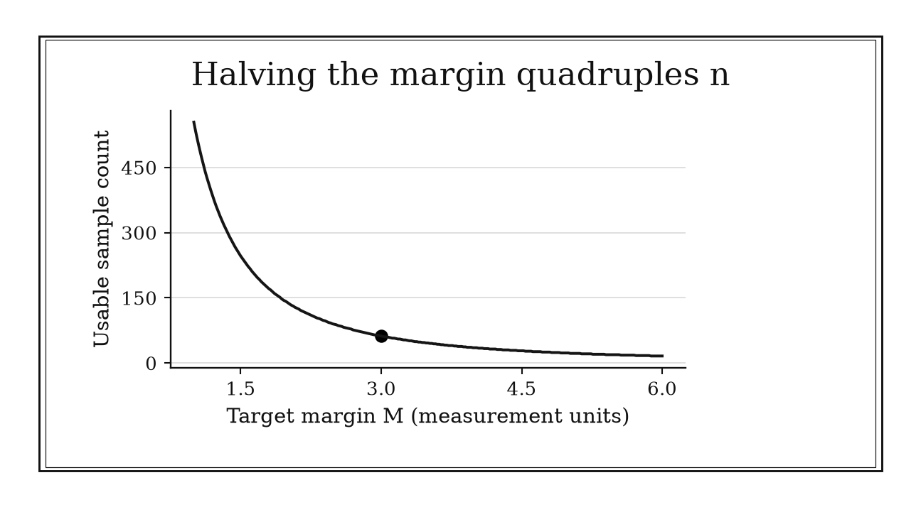
Figure 13.1. With planning SD=12 and a 95 percent normal critical value of 1.96, the required count is ceil((23.52/M)²). A margin of three needs 62 usable independent observations.
13.1.6: Conservative Sample Size for a Proportion
History
Planning a survey without knowing the rate it will find can mean a study that runs out of budget still short of the precision promised. Edwin Bidwell Wilson’s 1927 paper on binomial confidence intervals exposed that underlying problem. The variance term (p(1-p)) is largest exactly at one half, whatever the unknown rate turns out to be, so planning a sample size around (p=1/2) is a modern companion calculation, not Wilson’s own recommendation. It converts plain ignorance about a rate into a defensible, conservative planning number.
The equation
For desired margin (M),
[ n . ]
At 95% confidence, the upper planning value is
[ n. ]
How to read it
When the true proportion is unknown, planning at 50% maximizes the binomial variance and supplies a conservative normal-approximation sample size. This is not an exact finite-sample coverage guarantee. As the desired margin (M) shrinks, the needed sample size grows with (1/M^2): a five-point margin needs a much smaller sample than a one-point margin.
What this does not protect against: a badly designed sample, non-response, or a population that does not match the sampling frame.
How to use it
A district research office is planning a survey to estimate what share of families support a proposed later school start time, with no solid prior estimate. Aiming for a five-percentage-point margin at 95% confidence,
[ n= =384.16, ]
so the office plans to collect 385 completed responses. Because response is typically uneven by neighborhood and grade, the office inflates that number and weights results afterward to correct for who replied. If earlier surveys in similar districts suggest support clusters well away from 50%, say around 20%, the office can justify a smaller planning sample using that value, if it documents the assumption. This is a Workflow heuristic: it supplies a conservative starting value inside a broader survey or study-design calculation.
13.1.7: Two-Arm 80% Power Sample-Size Shortcut
History
A clinical pilot can run cleanly and still fail for a boring reason: it was never large enough to see the effect sought. Jerzy Neyman and Egon Pearson’s 1933 theory of efficient statistical tests gave that failure a fix, treating power, the chance of detecting a real effect, as an explicit design target alongside the false-positive rate. The coefficient near sixteen used here specializes that framework to two equal-sized, independent, normally distributed arms with common variance, a two-sided 5% false-positive rate, and 80% power.
The equation
Under those conditions,
[ n_{} (z_{0.975}+z_{0.80})^2 . ]
The mental version rounds 15.7 to 16.
How to read it
For two equal groups compared on some continuous measurement, the variance, the spread squared, of their difference is twice the individual variance divided by the sample size in each arm. Adding the critical value for false positives to the one for desired power produces the roughly-sixteen coefficient. The shortcut becomes about 16 divided by the square of (the effect you want to detect divided by the person-to-person spread), giving the observations needed per arm.
Where the shortcut stops: this coefficient is locked to 5% two-sided testing and 80% power. A stricter false-positive rate or higher power raises the number well above sixteen.
How to use it
A hospital research team is planning a small pilot trial and expects the treatment to shift an outcome by half a standard deviation, ():
[ n_{}==64. ]
The shortcut gives 64 analyzable patients per arm, well above the 15 or 20 informally budgeted. Treating 64 as a floor, the team builds in extra patients for expected dropout, protocol deviations, and assignment imbalance. Reusing a noisy effect estimate from a much smaller internal pilot as the planning value for () can leave the final trial dangerously underpowered, since small pilots routinely overstate effect sizes. This is an Independent rule: under its explicit two-arm regime, it directly converts a standardized target effect into a memorable sample budget.
13.1.8: Rule of Three for Zero Observed Events
History
Report zero contaminated samples in a large batch, and the natural conclusion, that the product is safe, can be exactly wrong. James Hanley and Abby Lippman-Hand addressed that misreading in a 1983 JAMA note, showing that zero observed occurrences do not mean zero underlying risk. They gave a simple, approximate 95% upper bound on the true rate: three divided by the number of trials. Seeing nothing go wrong is evidence of safety, never proof.
The equation
For zero events in (n) independent equal-risk trials, solve
[ (1-p_U)^n=0.05, ]
giving
[ p_U=1-0.05^{1/n} . ]
How to read it
The upper bound this rule produces is the largest risk rate for which observing zero events would still happen about 5% of the time by chance. It comes from approximating the odds of no failures across many independent trials at a small, unknown rate, using ((1-p)^ne^{-np}).
The honest limit: a zero count in the numerator does not shrink the risk to zero. It leaves a nonzero uncertainty ceiling that can still matter, especially when the sample size is modest.
How to use it
A food safety inspector reviews test results showing zero contaminated samples among 100 units pulled from a production run. The quick bound is
[ =0.03, ]
and the exact calculation, (1-0.05^{1/100}), confirms the true contamination rate could still be as high as roughly 3%. Before signing off, the inspector checks that the 100 units really represent 100 independent opportunities for contamination: samples pulled from the same production cycle, or equipment not yet cleaned between runs, may supply far fewer genuinely separate trials. For a different confidence level, unequal exposure, or any nonzero count, the inspector reaches for a full binomial or Poisson interval instead of this shortcut. This is an Independent rule: for the zero-event binomial case, it directly converts exposure count into an honest upper-risk statement.
13.1.9: Prefer the Wilson Interval to the Wald Interval
History
Two analysts can plug the same small sample into two textbook formulas and land on two confidence intervals, one of which quietly reports an impossible range. Edwin Bidwell Wilson settled that dispute in 1927 by inverting the binomial score test rather than trusting the ordinary symmetric interval. The older Wald construction freezes its uncertainty estimate at the sample’s own proportion and can extend past zero or one, bounds the event can never cross. Wilson’s score interval instead lets the uncertainty shift the center of the range away from a fragile boundary estimate.
The equation
With (z=z_{1-/2}), Wilson’s center is
[ c=, ]
and its half-width is
[ w= . ]
The interval is (cw).
How to read it
Wilson’s interval is asymmetric, meaning it does not sit centered exactly on the observed rate, because it lets the underlying uncertainty pull the center away from an extreme sample proportion. Its quadratic construction keeps both endpoints between zero and one.
What Wilson does not fix: it still assumes ordinary binomial sampling and cannot repair a biased sample, though it will not collapse to zero width at an extreme sample.
How to use it
A sports analyst is evaluating a rookie pitcher with 1 strikeout call overturned in 10 challenged pitches this season, a 10% rate on a very small sample. At 95% confidence, Wilson’s center and half-width work out to
[ c=,w,cw, ]
wide but inside the possible zero-to-one range. The symmetric Wald interval, by contrast, extends below zero, an impossible reading the analyst would have to clip before presenting it to a coaching staff. Reporting the Wilson range alongside the raw count, 1 out of 10, keeps the small sample honest. Before using either interval for a roster decision, the analyst checks whether pitches were selectively chosen for review, since optional stopping would break the assumption behind either method. This is a Workflow heuristic: it selects a more reliable interval construction within a larger proportion-inference process.
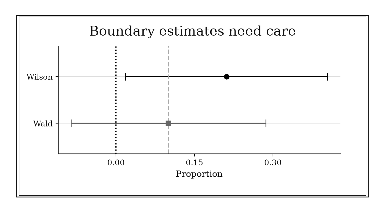
Figure 13.2. For one success in ten trials, the 95 percent Wilson interval stays inside [0,1], while the unmodified Wald interval extends below zero. This compares interval construction, not empirical coverage.
13.1.10: Plus-Four Interval for a Proportion
History
A results table showing a flat, zero-width confidence interval, [0, 0], is an artifact that should make a reader suspicious. Alan Agresti and Brent Coull found, in a 1998 study of binomial confidence intervals, that the standard textbook Wald interval’s actual coverage could be poor, especially near zero or one. Their fix was simple and hand-calculable: add two imaginary successes and two imaginary failures, then run the ordinary interval calculation on the adjusted counts. That plus-two, plus-two add-on is tailored to a 95% interval, where (z^2) is roughly 4, not to any real additional data collected in the field.
The equation
For a 95% interval, define
[ n=n+4, p=, ]
then calculate
[ p . ]
The number four is tied to (z^2).
How to read it
The adjustment adds four pretend observations, two successes and two failures, before calculating a standard interval, which stops the estimated variance from collapsing to zero at an observed boundary. The pull those four add toward one half is strong at (n=20) and nearly invisible at (n=1000). It is an approximation built for hand calculation, not literally fabricated data.
The number’s fine print: four is tuned specifically for a 95% interval. Other confidence levels need a different, (z^2)-based number of pretend observations.
How to use it
A neighborhood association surveys 20 residents about support for a new noise ordinance and finds zero in favor, (x=0,n=20). The plain Wald interval collapses to the degenerate range ([0,0]), implying certainty that nobody could ever support it. Using the plus-four adjustment instead,
[ p==0.0833,=0.0833(0.0564)=0.0833, ]
gives a workable, nondegenerate interval near ([-0.027,0.194]). Because a negative lower bound cannot describe a real proportion, the association either clips that endpoint at zero or reruns the calculation with a Wilson interval that respects the boundary naturally. The board treats the four added observations as a calculation device only, never adding them to the reported count of actual respondents. This is an Independent rule: for a routine 95% binomial interval, it directly supplies a fast stabilized calculation.
13.1.11: Use t Rather Than z When Sigma Is Estimated
History
A lab measurement’s uncertainty depends on the population’s true spread, essentially never known in advance and estimated from the same small batch of readings. William Sealy Gosset worked through exactly that in his 1908 paper, published in London under the name Student. Using the sample’s own spread as a stand-in for the true one adds extra uncertainty a normal distribution does not account for, so Gosset derived a new, heavier-tailed sampling distribution to reflect it. That correction gave small-sample researchers an interval width they could trust, instead of one borrowed from an assumption too thin for their data.
The equation
For iid normal observations with unknown (), use
[ X t_{1-/2,n-1}, ]
not
[ X z_{1-/2}. ]
How to read it
Dividing an estimated mean’s error by a spread estimated from the same normal sample produces heavier statistical tails than dividing by a known, fixed spread. The degrees of freedom, (n-1), one less than the sample size, record how much independent information remains after estimating that spread. At (n=10), swapping in the normal cutoff 1.96 for the correct (t) value of 2.262 understates the interval’s width by ((2.262-1.96)/2.262), about 13%.
What (t) does not rescue: a tiny sample with severe skew or outliers still calls for a design-aware robust or resampling analysis, not blind faith in the multiplier.
How to use it
A chemistry lab technician takes 10 replicate measurements of a solution’s concentration and wants a 95% interval around the mean. Using the correct value for 9 degrees of freedom, (t_{0.975,9}=2.262), instead of 1.96, the technician reports an honestly wider range reflecting how little 10 measurements can pin down the true spread. If the readings come from a more complex design, several instruments or operators, the correct degrees of freedom for that structure replace the simple (n-1). This is a Workflow heuristic: it selects the correct reference distribution when the noise scale is estimated.
13.1.12: Fisher z Interval for a Correlation
History
Treat a sample correlation near plus or minus one as an ordinary normally distributed number, and the resulting confidence interval fails visibly: it can extend past one or past negative one, bounds a correlation can never cross. R. A. Fisher addressed that failure in a 1921 paper, transforming the sample correlation using the inverse hyperbolic tangent function. On that transformed scale, the sampling distribution becomes approximately normal, and its spread stops depending so heavily on the correlation’s own value.
The equation
For Pearson correlation (r), with (|r|<1), from (n>3) iid pairs drawn from an approximately bivariate-normal population,
[ z_r=(r) =(), SE(z_r). ]
Form the interval on the (z_r) scale and map endpoints back with ().
How to read it
A correlation, written (r), measures how closely two variables move together on a scale from negative one, perfectly opposite, to positive one, perfectly aligned. Because that scale is bounded and stretched unevenly near the edges, Fisher’s transformation, (z_r), reshapes (r) onto an unbounded line where its sampling error behaves like an ordinary, symmetric normal spread. Mapped back to correlation units, the resulting interval is no longer symmetric around the original estimate: that lopsidedness is what the transformation buys, not a flaw.
What this interval leaves unaddressed: outliers, nonlinearity, and causation behind the correlation are no part of what it tests.
How to use it
An HR analyst finds (r=0.60) between an internal engagement score and a team’s retention rate, across 50 teams. Transforming gives
[ z_r=(0.60)=(1.60/0.40)=, SE=, ]
and the 95% interval on the (z_r) scale, (0.693(0.146)=0.693=[0.407,0.979]), maps back through () to roughly ([0.39,0.75]). The analyst reports that wider, asymmetric range rather than a falsely tidy plus-or-minus figure around 0.60. Before recommending an engagement program on the strength of that number, the analyst checks that the team pairs are plausibly iid and approximately bivariate normal, with a linear relationship free of a few outlying teams, since either problem can distort a Pearson correlation without showing up in the interval. This is a Workflow heuristic: it transforms a bounded correlation problem into an approximately normal interval calculation.
13.1.13: Correlation Significance Is Roughly Two Over Root N
History
A correlation found in a backtest is almost never exactly zero, so the real question is whether it is any bigger than pure chance would produce. William Sealy Gosset answered precisely that question in 1908, using W. R. Macdonell’s measurements of height and finger length for 3,000 people. The measurements, randomized on cards and split into 750 samples of four, let him pair one sample’s heights with the next’s finger lengths, destroying any real relationship; the 750 resulting correlations formed an almost flat distribution, an empirical null built from shuffled cards, published as Student in Biometrika. The exact (t) expression and (2/n) screen below are modern forms, not Gosset’s own formulas.
The equation
For (n>2) independent paired observations from an approximately bivariate-normal population, under (H_0:),
[ t= t_{n-2}. ]
If (c=t_{1-/2,n-2}), the exact two-sided critical magnitude is
[ r_{}= . ]
At two-sided () and moderate or large (n), this is roughly (2/n).
How to read it
To tell a real correlation from chance, a sample correlation, written (r), needs to reach about (2/n) in magnitude to count as distinguishable from zero at the usual 5% threshold, where (n) is the number of paired observations. At 100 pairs that cutoff is (2/=0.20); at 400 pairs, (2/=0.10).
Worth remembering: this is a significance screen, not a measure of how much the relationship matters. A correlation below the cutoff can still be real but imprecise, and one above it can be too small to matter in a huge sample.
How to use it
A quantitative analyst backtests a trading signal against next-day returns over 100 trading days and finds (r=0.21). The quick screen puts the cutoff at (2/=2/10=0.20); 0.21 clears it, but the analyst checks the exact threshold before committing capital: with 98 degrees of freedom, the exact critical value is (c=t_{0.975,98}=1.984), giving
[ r_{} === . ]
The 0.21 result clears that bar too, while a signal at (r=0.18) would not. Before acting, the analyst confirms the daily returns are not serially correlated, and checks whether the signal is the best of many tested, since a best-of-many search needs a stricter, multiplicity-adjusted threshold. This is an Independent rule: once its sampling conditions are credible, (n) and (r) provide a zero-correlation screen.
13.2: Robust Summaries and Efficient Designs
Data analysis gains precision not only by collecting more observations but by choosing a scale, summary, and design that respect how information is generated. These nineteen rules handle multiplicative outcomes, resistant displays, dependence, survey designs, pairing, blocking, allocation, pilots, and efficient factorial experiments.
13.2.1: Geometric Mean for Compound Growth
History
A portfolio that actually lost money over two years can look, on the ordinary average of its yearly percentage changes, like it broke even. Donald McAlister worked out why in 1879, in London: a skewed frequency law emerges when effects multiply rather than add, and on a logarithmic scale such a distribution turns symmetric, its central value geometric rather than arithmetic. McAlister was studying a multiplicative law, not writing an investment guide, though his result is why growth factors need a product-based average, not a summed one.
The equation
For positive factors (x_1,,x_n),
[ G=({i=1}{n}x_i){1/n} =(1n{i=1}^{n}x_i). ]
With unequal exposure lengths, replace the equal log average by an exposure-weighted one.
How to read it
The geometric mean is the constant growth factor that, applied every period, produces the same final total as the actual sequence of ups and downs. Logs convert multiplication into addition, so averaging the logs and exponentiating preserves true compounding, unlike averaging the factors themselves. The arithmetic mean overstates the true compound rate whenever returns vary, since gains and losses act on a changing base.
What the geometric mean leaves out: how bumpy the ride was, since two sequences ending at the same geometric mean can swing very differently along the way.
How to use it
A retail investor’s brokerage account gained 50 percent in its first year and lost 50 percent in its second, factors of 1.5 and 0.5. The statement averages those changes the plain way, ((50-50)/2=0), suggesting it broke even. The true compound factor is the geometric mean:
[ G= = , ]
a compound decline of about 13.4 percent per year. Over two years, (10{,}000(1.5)(0.5)=10{,}000(0.75)=7{,}500) dollars, equivalently (10{,}000(0.866)^2500), well short of break-even. The investor now asks any advisor to quote compound annual growth, not an average of yearly percentage changes.
The rule needs every factor strictly positive: a total-loss year, a factor of zero, would collapse the whole geometric mean to zero even if other years were strong, so it cannot describe a wipeout followed by fresh contributions of new money. This is an Independent rule: for positive multiplicative factors, it directly returns the constant compound factor with the same cumulative product.
13.2.2: Log Transform for Multiplicative Variation
History
Right-skewed measurements do not settle the question of scale by themselves: model the raw numbers, or take logarithms first, and the two choices imply different centers. The same 1879 McAlister paper cited earlier in this chapter anticipated that choice: a frequency law arises when small effects combine multiplicatively, and such a distribution turns symmetric on a logarithmic scale. McAlister was not adjudicating a modern modeling dispute; that framing is a later gloss. His paper documents the reason the choice has an answer: when the process multiplies, the logarithm is the scale the errors actually live on.
The equation
A log-additive model
[ Y=+ ]
corresponds on the original scale to
[ Y=e^e^. ]
For small changes,
[ Y. ]
How to read it
A logarithm turns multiplication into addition: the log of a product equals the sum of the logs. The coefficient (), the fitted effect on the log scale, the model’s per-unit push, corresponds to a multiplicative factor (e^), close to a percentage change, (100%), only when () is small. This matters most for measurements like concentrations, where scatter grows in proportion to level rather than staying fixed.
Taking logs re-expresses the question in units where products become sums; it does not guarantee a straight-line relationship, normal leftover error, or any causal story.
How to use it
An industrial hygienist tracks airborne solvent concentration across ten shifts and gets right-skewed readings, mostly low with occasional large spikes. Working with (Y), the hygienist fits (Y=+) and finds a shift-type coefficient of 0.08. Converting back,
[ e^{0.08}=1.083, ]
an 8.3 percent increase, close to the small-effect approximation (100(0.08)%=8%) but not identical. The hygienist reports that ratio, not a plain difference in parts per million.
The shortcut assumes the variation is genuinely multiplicative and no reading is zero or negative; a sensor reporting a floor of zero needs a model built for that floor, not a constant added to force a logarithm through. This is a Workflow heuristic: it selects an additive representation for a broader analysis when positive outcomes vary multiplicatively.
13.2.3: Tukey’s 1.5-IQR Outlier Fences
History
Deciding which data points deserve a second look, without a rule for it, invites both sloppiness and overreaction. John Tukey addressed that problem in his 1977 book Exploratory Data Analysis, organizing resistant summaries and graphical inspection, including the box-and-whisker plot and its inner fences, set 1.5 interquartile ranges beyond the box’s edges. Tukey meant the fences as an invitation to look closer: a flagged point earns a question, never an automatic conclusion.
The equation
Let
[ IQR=Q_3-Q_1. ]
The inner fences are
[ Q_1-1.5,IQR Q_3+1.5,IQR. ]
Values beyond them are flagged for review.
How to read it
Quartiles split ordered data into four equal-sized groups; (Q_1) is a quarter of the way up, (Q_3) three quarters up, and the interquartile range, (IQR=Q_3-Q_1), is the width of the middle half. An outlier fence is a boundary built from that width: values 1.5 IQRs beyond (Q_1) or (Q_3) get flagged for a closer look, not thrown out automatically.
A flagged point could be an error, a rare but real event, or a subgroup mixed into the data, and the fence alone cannot say which. Under exact normality the fences sit about 2.7 standard deviations from the center, but the rule itself does not assume normality.
How to use it
A regional shipping depot manager reviews this week’s parcel transit times: the middle half runs between (Q_1=10) and (Q_3=18) hours, so
[ IQR=18-10=8, ]
and the fences sit at
[ Q_1-1.5(8)=-2,Q_3+1.5(8)=30. ]
Parcels at 40 and 52 hours clear that fence. Checking them, the manager finds both routed through one regional hub with a shift change that week, not a fleet-wide problem.
Transit times are naturally right-skewed, since delays can stack up but a parcel can never arrive early without limit, so even a healthy week can throw a few points past 30 hours with nothing wrong. Comparing flagged parcels against hub schedules keeps the fence a diagnostic tool rather than an automatic cutoff. This is an Independent rule: it directly creates a resistant exploratory flagging range while leaving the scientific decision open.
13.2.4: Robust z-Scores from the Median and MAD
History
A single wildly mismeasured reading can drag an ordinary mean and standard deviation so far off course that every other point starts to look normal by comparison. Frank Hampel addressed that in a 1974 paper worked out in Zürich, formalizing the influence curve to measure an estimate’s sensitivity to contamination. His program elevated the median and median absolute deviation, MAD, as resistant stand-ins for the mean and standard deviation. The scaling constant is a later convention; the principle itself is Hampel’s.
The equation
With sample median (x),
[ MAD=i|x_i-x|, {}=1.4826,MAD, ]
and
[ z_i^{} =. ]
How to read it
The median is the middle value of a sorted list, unmoved by how extreme the top or bottom entries get. MAD measures spread the same resistant way: the median of each point’s distance from the median. Multiplying MAD by 1.4826 gives a normal-reference scale estimate, agreeing asymptotically with the standard deviation for Gaussian data, so a robust z-score, distance from the median divided by rescaled MAD, reads on a familiar scale.
A large robust z-score is a flag for review, not proof a value is wrong. Median and MAD tolerate up to half the data being extreme before they get dragged off course, far more than a mean and standard deviation offer.
How to use it
A fab process engineer is screening 40 wafer-thickness measurements, in micrometers. The batch’s median is 10 and MAD is 2, so the rescaled robust spread is
[ _{}=1.4826(2)=2.965. ]
One wafer measures 19 micrometers, giving a robust z-score of
[ , ]
past the review threshold of about 3. Two other wafers, at 30 and 35 micrometers, have already pulled the ordinary mean and standard deviation upward, so a plain z-score there would come out smaller and miss the flag.
The robust score can misfire too: with many measurements tied at the same value, MAD can collapse to zero. This is an Independent rule: it directly supplies a contamination-resistant standardized distance when median and MAD are informative.
13.2.5: Freedman-Diaconis Histogram Bin Width
History
Bin width decides what story a histogram tells: too wide, and real structure disappears; too narrow, and sampling noise turns into apparent bumps. David Freedman and Persi Diaconis addressed that choice in a 1981 paper carried out in Berkeley, California, proposing a width proportional to the interquartile range times sample size to the negative one-third power. Using the interquartile range in place of the standard deviation made their rule less sensitive to extreme measurements. The rule remains a starting display choice, not a uniquely correct partition.
The equation
For sample size (n),
[ h=2,IQR(x),n^{-1/3}. ]
An approximate bin count over the observed range is
[ , ]
rounded and aligned to sensible boundaries.
How to read it
More data supports narrower bins, but only slowly: doubling sample size shrinks the recommended width by a factor of (2^{-1/3}), not by half. The interquartile range supplies the physical scale, keeping extreme values from forcing artificially wide bins the way the standard deviation would.
Width alone does not fully determine what a histogram shows: sliding the first bin’s starting point can reveal or erase the very features under discussion. A histogram is an exploratory sketch, not the distribution itself.
How to use it
A district assessment coordinator is building a histogram of this year’s 1,000 test scores, with an interquartile range of 12 points. The suggested bin width is
[ h=2(12)(1000)^{-1/3} ==2.4, ]
and over a 48-point range, that suggests about (48/2.4=20) bins. Twenty bins over 48 points would split scores at fractional boundaries that do not match the district’s whole-point grading scale, so the coordinator rounds to a clean width of 2 points.
The rule can mislead if scores cluster at a few discrete values, since a formula built for continuous measurements can suggest more bins than the data can fill. Shifting where the first bin begins, at the chosen width, is worth trying once as a sensitivity check. This is an Independent rule: for a continuous exploratory sample, it directly supplies a robust first histogram width.
13.2.6: Silverman’s Rule-of-Thumb KDE Bandwidth
History
Every kernel density estimate ships with a default bandwidth, and that number silently sets what shape the picture shows before anyone chooses one on purpose. Bernard Silverman took on that judgment call in a 1986 monograph, Density Estimation for Statistics and Data Analysis, synthesizing kernel-density methods into a normal-reference bandwidth formula. The formula scales a robust spread measure by sample size to the negative one-fifth power, offered as a practical starting prescription tied to a bell-shaped reference distribution, not a guarantee for every shape of data.
The equation
For a one-dimensional Gaussian-kernel estimate,
[ h=0.9(s,)n^{-1/5}. ]
The smaller scale estimate limits inflation by outliers, and (n^{-1/5}) is the density-estimation rate.
How to read it
Bandwidth is the smoothing window a kernel density estimate slides across the data; it trades chasing noise, when narrow, against erasing real bumps, when wide. Density estimation improves more slowly than estimating a mean, so a large jump in sample size only shrinks bandwidth modestly.
A bump in the resulting curve is not by itself proof the population has that feature; it can be smoothing residue instead. Kernel shape usually matters far less than bandwidth.
How to use it
A transit planner is sketching a density of 500 recorded commute durations, in minutes. The standard deviation is 10 and the interquartile range is 12, so the robust scale is
[ , ]
giving a bandwidth of
[ h(8.96)(500)^{-1/5}=0.9(8.96)(0.29) ]
minutes. Plotted at that width, the density shows one broad hump with a shoulder near 45 minutes. A narrower bandwidth splits that shoulder into a second peak, consistent with an express-bus schedule; a wider one erases it. The planner reports both curves, since they disagree about whether express riders form a genuinely separate group.
Because the formula assumes a single-humped population, a sharp cutoff, such as durations recorded only during service hours, can distort the curve near that boundary. This is an Independent rule: under its univariate normal-reference regime, it directly supplies an initial KDE smoothing scale.
13.2.7: AR(1) Effective Sample Size
History
A long run of time-correlated readings still gets counted as though each one were independent evidence, so the resulting average looks far more precise than it is. M. S. Bartlett took on that consequence in 1935, in work done in Cambridge, England, helping establish that a long sequence of dependent measurements does not carry the information of the same count of independent ones. The compact AR(1) expression used today, assuming correlation decays geometrically with time separation, is a modern specialization of Bartlett’s variance principle; he did not write it out in exactly that form.
The equation
For a long stationary series with
[ _k=^k, ||<1, ]
the effective size for estimating the mean is approximately
[ n_{} n. ]
The corresponding variance inflation is ((1+)/(1-)).
How to read it
Autocorrelation is the tendency of a measurement to resemble its own recent past, for example a grid’s power load this minute looking like its load a minute ago. Positive persistence repeats the same information, so a long correlated series behaves like a shorter independent one; effective sample size shrinks by ((1-)/(1+)), where () is the correlation between readings one step apart. Negative correlation can instead make a series more informative than its raw count suggests.
This shortcut leaves out seasonal patterns, slow drifts, or long memory, along with finite-sample edge effects the approximation ignores.
How to use it
A grid operations analyst has 1,000 one-minute load readings from a feeder line and estimates their lag-one correlation at (). The effective sample size is
[ n_{}=1000(). ]
Treating all 1,000 readings as independent would understate the standard error by roughly
[ , ]
threefold, which matters when deciding whether observed load sits safely below a transformer’s rated capacity. The analyst builds the confidence band around 111 effective readings, not 1,000.
This shortcut assumes the feeder’s load behaves like a stable AR(1) process; a new industrial customer coming online mid-window would break that assumption until reestimated on post-shift data. This is an Independent rule: within an AR(1)-like regime, it directly translates serial persistence into mean-information loss.
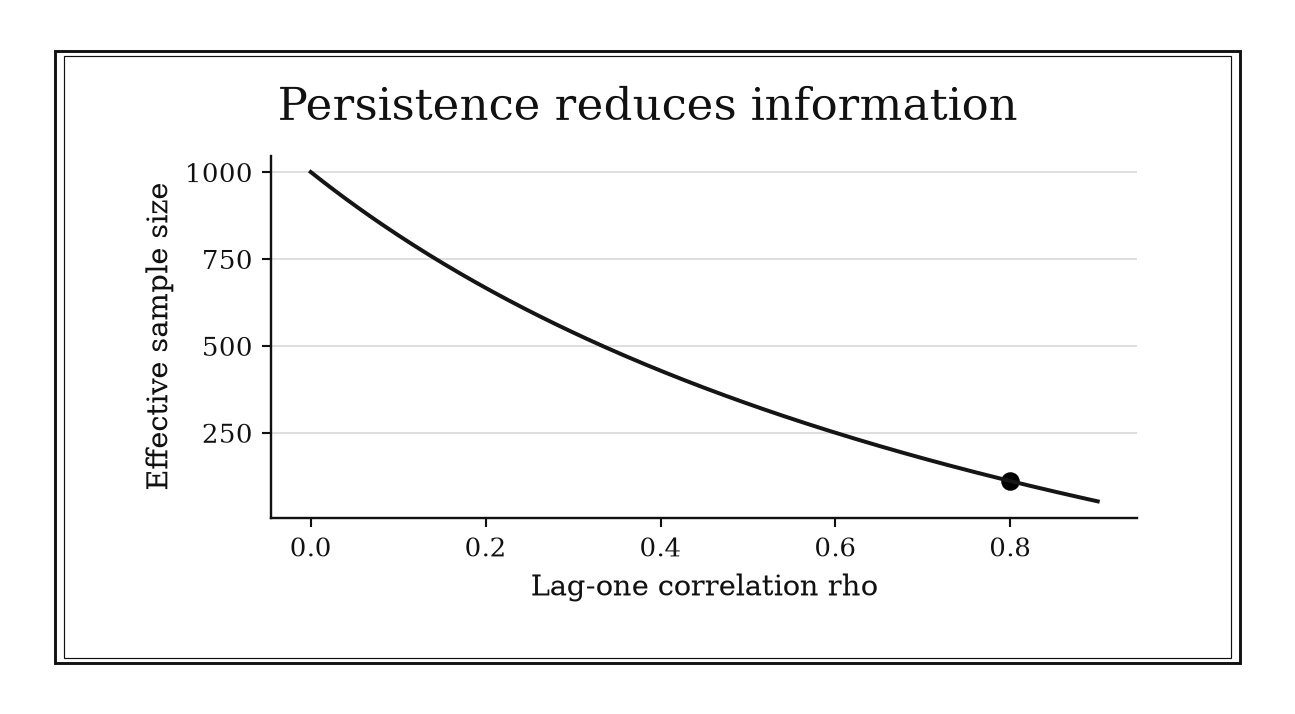
Figure 13.3. For a long stationary AR(1) series with n=1000, the approximation n_eff=n(1-rho)/(1+rho) gives about 111 at rho=0.8. The formula is specific to estimating the mean in this regime.
13.2.8: Kish Effective Sample Size for Unequal Weights
History
One thousand completed interviews are not automatically more informative than 640: unequal weighting can erase the advantage entirely. Leslie Kish settled that kind of dispute in his 1965 book Survey Sampling, developed in Ann Arbor, organizing how clustering and unequal weights change precision relative to a simple random sample. His design-effect language gave nominal and effective sample size separate names.
The equation
For positive weights,
[ n_{} =. ]
When the weight coefficient of variation is defined consistently,
[ DEFF_w+CV_w^2, n_{}=. ]
How to read it
A design effect compares the variance a real sampling design produces against a simple random sample of the same size; above 1 means the design behaves like a smaller, equal-weight sample. When survey weights vary a great deal, the weighted average’s variance grows, and (n_{}) reports how many equal-weight respondents would carry the same information.
Clustering, stratification, and any calibration built into the weights sit outside this formula, and can push the true design effect higher or lower than weight variability alone predicts.
How to use it
An opinion pollster completes 100 interviews, but 20 respondents from one district each carry a weight of 4, while the other 80 carry a weight of 1. The weight totals are
[ w_i=80(1)+20(4)=160,w_i^2=80(1)+20(16)=400, ]
so the effective sample size is
[ n_{}===64. ]
The pollster recalculates the margin of error using 64, since the weighting has already cost the equivalent of 36 respondents’ worth of precision.
The formula assumes weights are unrelated to how respondents answered; if the district holds unusually strong opinions, the weighting could be informative rather than incidental, and a design-based variance calculation would be the honest next step. This is an Independent rule: under Kish’s fixed-weight mean model, it directly quantifies the precision cost of unequal weights.
13.2.9: Cluster Sampling Design Effect
History
Interviewing whole clinics or whole classrooms instead of scattered individuals is cheaper to organize, but it raises a real problem: people sampled from the same group resemble each other, so the nominal respondent count can overstate what was actually learned. The same 1965 Kish book cited earlier in this chapter, Survey Sampling, placed clustering inside a framework for comparing a complex design against a simple random sample. Its design-effect language turned that overstatement into a number: how much variance a clustered sample carries relative to independent sampling.
The equation
For approximately equal cluster size (m) and intracluster correlation (),
[ DEFF+(m-1), n_{}. ]
The variance and standard error are inflated approximately by (DEFF) and (), respectively.
How to read it
A cluster is a naturally occurring group, a clinic, a classroom, a neighborhood block, sampled as a whole rather than drawing scattered individuals across the population. People inside the same cluster tend to be more alike than two people picked at random from the full population, a resemblance measured by the intraclass correlation, (). One respondent supplies a genuinely new observation; a second respondent from the same cluster supplies information that partly overlaps with the first, and that overlap compounds across every member of the cluster.
This design effect is a planning approximation for roughly equal-sized clusters and a common correlation, not an exact formula for every possible estimator or an unequal mix of cluster sizes.
How to use it
An epidemiologist plans a survey of 20 clinics with 20 patients per clinic, expecting an intraclass correlation of () based on similar past surveys. The design effect is
[ DEFF=1+(20-1)(0.05)=1+19(0.05)=1.95, ]
so a sample of 400 patients, 20 per clinic across 20 clinics, carries roughly the precision of
[ 400/1.95 ]
independently sampled patients. Budgeting the analysis as though only 205 were independent keeps the study from overstating its own precision to funders.
Clustering by clinic is convenient, but the correlation is estimate-specific: patient age might cluster strongly while a rare complication rate might not, so the 0.05 borrowed from a similar outcome will not automatically fit every question on the same survey. This is a Workflow rule: it converts a proposed clustered design into a precision adjustment inside a larger sample-size or variance calculation.
13.2.10: Finite-Population Correction After a Noticeable Sampling Fraction
History
A precision calculation that returns zero remaining uncertainty looks broken, until the detail turns out to be that every member of the population was actually sampled. Jerzy Neyman placed that limiting case inside a rigorous framework in a 1934 paper brought before the Royal Statistical Society in London, developing optimum allocation for finite, listed populations. The correction for sampling without replacement follows directly from his finite-population setting. Checking it only once the sampled fraction passes roughly five percent is a later practical convention; Neyman himself proposed no such threshold.
The equation
For a simple random sample of (n) units without replacement from (N),
[ SE_{} =SE_{} . ]
The square-root term is the finite-population correction, or FPC.
How to read it
When a sample covers only a tiny slice of a finite, listed population, whether it is sampled with or without replacement barely matters. As the sampled fraction (n/N) grows, each unit drawn also rules out that same unit reappearing, so the finite-population correction, a factor () multiplying the ordinary standard error, shrinks accordingly. At a complete census, that factor reaches zero: no sampling uncertainty is left to describe.
The correction applies only to sampling without replacement from a genuinely finite target population, not to a large dataset that merely resembles a big fraction of some looser, unlisted population.
How to use it
A warehouse inventory auditor samples 200 stored parts from a complete roster of 1,000 to check for shipping damage. The finite-population correction is
[ FPC==, ]
so the ordinary standard error should be multiplied by about 0.895, a roughly 10.5 percent reduction. Reporting the tighter, corrected interval to plant management avoids overstating uncertainty about a genuine 20-percent sample of a fixed, complete list.
Because the sampling fraction here clears the rough five-percent trigger by a wide margin, the auditor applies the correction as routine. If the roster instead represents only this quarter’s incoming shipment, a list that keeps growing all month, the correction no longer describes a stable finite population, so the auditor treats the calculation as describing only the parts already on the shelf. This is a Workflow rule: it modifies an otherwise established standard-error calculation when the design and estimand justify it.
13.2.11: Measurement Error Attenuates Correlation
History
Two imperfectly measured variables will understate their own true relationship, sometimes badly. Charles Spearman confronted that stake in 1904, in work done in London, showing that fallible measurements weaken the observed correlation between the traits they measure. He proposed a correction connecting the observed, noisy correlation back to the correlation between underlying true scores, tied to how reliable each measurement is.
The equation
Under classical, independent measurement error,
[ r_{XY,} r_{XY,}, ]
where (R_X) and (R_Y) are reliabilities. Thus
[ r_{} . ]
How to read it
Reliability is a number between 0 and 1 describing how consistent a measurement is with itself, close to 1 for a precise instrument and close to 0 for a noisy one. Independent noise inflates each variable’s spread without adding shared signal: the shared movement between the two quantities stays the same while each one’s measured spread inflates, so the ratio shrinks. Observed correlation is roughly true correlation times the square root of the product of the two reliabilities.
This formula is no license to mechanically inflate an inconvenient correlation; it describes an idealized model, not a universal repair kit.
How to use it
An actuary wants to know how strongly a new proxy risk score predicts claims experience, and suspects the score is measured noisily, given known inconsistency in self-reported survey answers. Past validation puts both the score and the claims measure at reliability 0.64, and if the true correlation is 0.50, the expected observed correlation is
[ 0.50=0.50(0.64)=0.32. ]
An observed 0.32 is consistent with a much stronger true relationship once noise is priced in. Rather than dropping the score, the actuary invests in a more consistent survey instrument, since better reliability moves the correlation closer to 0.50 without changing which policyholders are actually higher risk.
The correction assumes both errors are independent of the true scores; if both are worse for policyholders filing complex claims, that shared error source can distort the correlation in a way this formula cannot repair. This is an Independent rule: it gives a broadly reusable explanation and sensitivity calculation for weakened correlations rather than serving only one fixed procedure.
13.2.12: Pair When Within-Pair Correlation Is Positive
History
Blaming a fertilizer trial’s poor result on the fertilizer misses the real threat: plot-to-plot differences in soil and drainage, left uncontrolled, swamp the treatment effect the trial was built to find. R. A. Fisher’s 1926 account of field experiments, from his work at Rothamsted Experimental Station in Harpenden, England, showed how comparing closely matched neighboring plots could turn that variation from a threat into a manageable nuisance. Fisher’s fields put local comparison to direct use; the compact variance formula used here is a modern statement of that same practice.
The equation
For two measurements with equal variance (^2) and correlation (),
[ (X-Y)=2^2(1-). ]
More generally,
[ (X-Y)=_X2+_Y2-2(X,Y). ]
How to read it
Pairing means measuring two related things, such as matched plots, or the same subject before and after, and analyzing their difference rather than each separately. If both measurements share the same variance and a positive correlation (), the variance of their difference is (2^2(1-)), smaller than the (2^2) two independent measurements would give.
Negative correlation flips the benefit into a cost: pairing measurements that move in opposite directions inflates the variance of their difference instead of shrinking it.
How to use it
An agronomist testing a new fertilizer wants to isolate its effect from ordinary soil variation. Rather than fertilizing one half of a field and leaving the other untreated, the agronomist pairs each treated plot with an adjacent untreated plot, expecting a within-pair yield correlation around () from past trials. With equal plot-to-plot variance (^2), the paired difference has variance
[ 22(1-0.75)=22(0.25)=0.5^2, ]
a quarter of the variance two unpaired plots would produce, letting the agronomist detect a smaller yield gain with the same number of plots.
The gain depends on the pairing being a genuine match: pairing a well-drained plot with a poorly drained one can produce a correlation near zero or negative, erasing the benefit or making the comparison noisier than two independent averages. This is a Workflow rule: pairing is a design choice whose benefit enters the variance and analysis of a larger comparison.
13.2.13: Block What You Can, Randomize What You Cannot
History
Every field hides a gradient, a slope in drainage or soil quality no eye can see, ready to betray any experiment laid across it. The same 1926 Rothamsted report cited earlier in this chapter for pairing, R. A. Fisher’s account of field experiments, joined two tools to prevent exactly that: group plots into blocks of similar conditions, then randomize which treatment lands where within each block. Blocking absorbed the known gradient; randomization protected the comparison from whatever nobody had thought to measure. The additive statistical model used today is a later formal expression of that same practice.
The equation
A simple randomized-block model is
[ Y_{ij}=+_i+j+{ij}, ]
where (_i) is the treatment effect and (_j) is the block effect.
How to read it
Blocking means grouping experimental units, plots, batches, patients, into clusters that are internally similar before assigning treatments, so a known source of variation, such as one field’s soil quality or one production line’s raw-material batch, gets absorbed into the block rather than contaminating the treatment comparison. Randomizing which treatment goes where within each block then protects against every other, unmeasured source of variation.
What blocking does not fix: treatment effects that behave differently from block to block, or blocks defined after seeing the results rather than from real, pre-treatment structure.
How to use it
A pharmaceutical production quality manager must test four candidate tablet formulations, expecting raw-material variation to differ from batch to batch. Rather than running all four on one batch, the manager treats each of five available batches as a block, testing all four in randomized order within every batch, twenty total test runs. Batch-to-batch shifts in raw-material potency land inside the block effect, not inside the formulation comparison, and standard errors are calculated with the batch structure preserved.
Because raw-material batches were the known nuisance factor, they became the blocks; anything unanticipated, such as a drift in ambient humidity, is handled by randomizing formulation order within each batch, not by blocking on it. Blocking on a factor that turns out not to matter would still cost the degrees of freedom needed to detect real formulation differences. This is a Workflow rule: it organizes a study and its analysis rather than producing a stand-alone numerical answer.
13.2.14: Use 50-50 Allocation When Per-Unit Costs and Variances Match
History
Under matching cost and variance, a two-arm trial’s allocation problem turns out to have one exact answer. The same 1934 Neyman paper cited earlier in this chapter for finite populations set out a general principle: sample more from a group that is larger, more variable, or cheaper to observe. Where both arms share the same cost and variance, that optimum collapses to the familiar even split, a direct consequence of Neyman’s framework rather than a separate result he stated on its own.
The equation
For independent arms with common variance (^2),
[ (X_1-X_2) =^2(+), n_1+n_2=N. ]
This expression is minimized at (n_1=n_2=N/2).
How to read it
Splitting a fixed total of subjects between two groups to minimize the variance of their difference is a balancing act: adding one subject to the smaller group helps more than removing one from the larger group hurts, since (1/n_1+1/n_2) reacts more sharply to a starved group. Under equal cost and variance, that balancing act is minimized exactly at an even split.
Equal allocation is an efficiency result under those symmetric conditions, not a universal rule; it says nothing about ethics, feasibility, or a study whose two arms differ in cost or spread.
How to use it
A trial biostatistician is finalizing enrollment for a two-arm study of 100 patients, with both arms expected to cost the same and have similar variance. A 50-50 split gives a variance factor of
[ +=0.040. ]
A proposed 75-25 split instead gives
[ ++0.0400=0.0533, ]
about one-third larger, meaning the uneven split would need more patients to match the even split’s precision. The biostatistician recommends the even allocation, stratifying by site.
If one arm instead required a scarce, expensive drug while the control used a cheap standard pill, the optimal split would shift toward the cheaper arm, and insisting on an even split by habit would waste budget without buying extra power. This is a Workflow rule: it supplies the default allocation within a broader design, power, and operational decision.
13.2.15: Neyman Allocation for Unequal Stratum Variability
History
Splitting a fixed survey budget evenly, or strictly by population share, across groups that differ wildly in variability wastes precision on the quiet group and starves the noisy one that actually needs attention. The same 1934 Neyman paper used twice already in this chapter solved that allocation problem directly, deriving how to split a stratified sample so a larger or more variable group receives more observations than a smaller, uniform one. The improvement over allocating by population size alone is Neyman’s own contribution; cost differences extend the same logic further.
The equation
With equal observation costs and a fixed total sample size, allocate
[ n_h=n, ]
where (N_h) is stratum size and (S_h) its outcome standard deviation.
Under a fixed total budget (C) and positive per-unit costs (c_h), the cost-adjusted optimum is
[ n_h= {_jN_jS_j}. ]
How to read it
Stratification means dividing a population into groups, or strata, before sampling, such as splitting a customer base into store formats, so each group’s sample size can be chosen deliberately. Neyman’s allocation grows a stratum’s ideal sample size with both population size and internal variability, its standard deviation: doubling either doubles that stratum’s weight (N_hS_h) relative to every other stratum.
This optimum concerns one target quantity under specific assumptions; a stratum can matter for reasons the formula cannot see, and the calculation still needs a genuine probability sample within every stratum.
How to use it
A retail chain’s research team is planning a survey across two equal-size store formats: warehouse stores, historically uniform, standard deviation 10, and city stores, which swing much more, standard deviation 20. With a total sample of (n=300), the strata’s (N_hS_h) values are in ratio 1 to 2, giving shares (1/(1+2)=1/3) and (2/(1+2)=2/3), so the team allocates
[ 300()=100 ]
to warehouse stores and
[ 300()=200 ]
to city stores, rather than 150 and 150, concentrating precision where it is needed.
Because that split came from a smaller pilot survey, the team treats it as a starting estimate, checking whether results stay sensible if city-store variability turns out closer to 15 or 25. The team also draws a genuine probability sample within each format, since disproportional allocation alone does not make the sample self-weighting. This is an Independent rule: it is a reusable allocation calculation across surveys and stratified experiments, though implementation still sits inside a full design.
13.2.16: Use a Pilot to Update Variance, Not to Test the Final Claim
History
A clinical trial sized before a single patient is enrolled rests on a guess about how variable the outcome will be, and a wrong guess quietly produces a study too small to see the effect it was built to find. Janet Wittes and Erica Brittain took that on in a 1990 paper, worked out in Bethesda, Maryland, describing an internal pilot phase that re-estimates nuisance variance partway through a trial and adjusts sample size. Their contribution was a division of labor: a pilot rescues planned precision without becoming an early test of the treatment effect.
The equation
For a mean estimated to margin (M), with a fixed critical-value multiplier (z^*) such as (z_{1-/2}) for a two-sided normal-theory interval, a variance update has the form
[ n_{} ()^2. ]
Equivalently, if an original plan used (s_0), then (n_{}/n_0(s_{}/s_0)^2).
How to read it
A pilot, here, is an early slice of a study’s own data used to check a planning assumption, most often the outcome’s variance, rather than judge whether the treatment works. Because sample size grows with the square of that spread (standard deviation) guess, a modest error can leave a trial substantially undersized; updating it partway through protects the trial’s ability to detect what it was designed to detect.
A pilot should not become a stand-in for peeking at the treatment effect itself; its estimate of that effect is extremely noisy, and proceeding only after an encouraging look exaggerates the odds of apparent success.
How to use it
A trial statistician planned a study assuming an outcome standard deviation of 10, requiring 100 patients. A blinded internal pilot instead estimates the standard deviation at 15. Updating the sample size,
[ 100()2=100(1.5)2=100(2.25)=225, ]
more than double the original plan. The statistician had pre-specified this update rule, including a cap on enrollment growth, so the adjustment is a prespecified correction, not an ad hoc reaction.
Because the pilot re-estimates variability from only a fraction of the planned patients, that 15 is itself noisy; the statistician plans for something closer to 225 while building in a contingency for the number shifting again. This is a Workflow rule: the pilot updates one planning input in a prespecified larger study rather than furnishing the study’s final claim.
13.2.17: Add Replicated Center Points to Screen for Curvature
History
Following a straight-line model past the point where a real process starts bending can send an optimization effort confidently in the wrong direction. George Box and K. B. Wilson tackled that stake in a 1951 paper, carried out amid industrial chemical experimentation in Manchester, England, setting out a sequential strategy for approaching optimal operating conditions. Their factorial designs added replicated runs at the center of the tested region to check whether a first-order model was still adequate. Box and Wilson used that logic on real industrial processes; the modern curvature-contrast statistic restates their comparison.
The equation
A simple curvature contrast is
[ C=y_{}-y_{}, ]
where (y_{}) averages the corner runs. Replicated center runs provide pure-error variation for judging whether (C) is large.
How to read it
A two-level factorial experiment tests each factor only at a low and a high setting, enough to estimate straight-line slopes but not whether the response bends between those extremes. Center points, runs at the middle setting repeated several times, supply an average to compare against the corners, and a measure of run-to-run noise to judge whether any gap is more than chance.
Center points test for curvature in aggregate; they cannot say which single factor is responsible, and a single center run cannot separate real curvature from noise at all.
How to use it
A bakery process engineer is optimizing oven temperature and time for a new bread line, whose corner runs average a crust-quality score of 50. Five center runs average 58, with little scatter. The curvature contrast is
[ C=58-50=8, ]
much larger than the noise among center runs, so the engineer concludes the straight-line model is bending and does not extrapolate the corner trend further.
Because the center runs were interspersed with the corner runs rather than baked at the end of the day, the engineer can rule out shift-to-shift oven drift as the source. Finding curvature flags that a response-surface design is needed next; the center points alone cannot say which factor is doing the bending. This is a Workflow rule: center points are a diagnostic stage that determines whether a larger sequential experiment should move from a first-order to a second-order design.
13.2.18: Use Resolution IV or Better to Screen Main Effects
History
A screening experiment can look perfectly clean, every main effect estimated, every p-value crisp, while silently confusing one factor’s real effect with some other pair of factors acting together. George Box and J. Stuart Hunter addressed that risk in a 1961 paper classifying fractional factorial designs by resolution, a number describing exactly which effects a fraction can and cannot tell apart. A resolution-IV design keeps every main effect free of confusion with any two-factor interaction, at the cost of letting two-factor interactions stay tangled with each other. Box and Hunter’s classification made that guarantee checkable before a single run was collected.
The equation
For a regular two-level fraction, resolution is the length of the shortest word in its defining relation. At resolution IV, no main effect is aliased with a two-factor interaction:
[ . ]
Main effects may be aliased with three-factor or higher terms, while
[ . ]
How to read it
In a fractional factorial design, only a chosen fraction of all possible factor combinations gets run, so some effects become aliased: two different effects, such as one factor’s main effect and another pair’s interaction, produce numerically identical evidence. Resolution classifies how bad that tangling gets; at resolution IV, no main effect is aliased with a two-factor interaction, though two-factor interactions can still be aliased with each other.
Resolution describes alias structure only. It protects main effects if interactions beyond two factors are genuinely negligible, an assumption the data cannot verify, and says nothing about which two-factor interactions remain tangled.
How to use it
An electronics test engineer wants to screen seven factors in a circuit-board process, but a full test would take (2^7=128) boards. A 16-run resolution-IV fraction cuts that eightfold, (128/16=8), while guaranteeing the seven main effects are not secretly tangled with any two-factor interaction, only with three-factor interactions assumed negligible.
Before running the experiment, the engineer prints the alias table and checks that no plausible interaction, such as temperature and dwell time, lands in a damaging alias set. A large effect is reported as genuine only under that sparse-interaction assumption; if two factors are suspected of interacting strongly, the engineer follows up with additional runs. This is a Workflow rule: resolution is a design-selection guardrail inside a sequential screening and confirmation program.
13.2.19: Use a Foldover to Break Key Fractional-Factorial Aliases
History
Running only a screening fraction and stopping there can leave a real main effect permanently entangled with an interaction nobody asked about. The same 1961 Box and Hunter account cited earlier in this chapter also supplied the fix: a foldover, a second set of runs with selected signs reversed, separates a main effect from the interaction it was tangled with. Their algebra made a sign reversal’s effect predictable, so added runs could be chosen deliberately rather than by trial and error.
The equation
A full sign-reversal foldover maps every coded setting by
[ x_j-x_j. ]
When that reversal produces a distinct complementary fraction, combining the two designs can reverse alias signs between odd- and even-order terms, such as a main effect and a two-factor interaction. Same-parity aliases can remain. A partial foldover reverses only chosen factors to target particular ambiguities.
How to read it
A foldover reverses the sign of some or all factors and runs that mirrored set as a second stage. Combining original and mirrored runs changes alias relationships between effects of different orders: a main effect and an interaction it was tangled with can come apart, though same-order effects can remain aliased.
A foldover buys clarity by adding runs; it does not retroactively fix the first fraction’s design, and a full foldover can double the total run count.
How to use it
A quality engineer at a detergent formulation lab found factor (A), surfactant concentration, aliased with the interaction between (B) and (C), fragrance level and dye concentration. A foldover reversing the sign of (A) changes that alias relationship and can change others, so the engineer checks the full alias structure of the combined design.
Running the mirrored trials separates (A)’s main effect from the (BC) interaction. The original 16 runs plus a 16-run mirrored set bring the study to 32 batches. Because the stages ran weeks apart, the engineer blocks the analysis by stage, guarding against a raw-material shift masquerading as de-aliasing. This is a Workflow rule: it is a targeted follow-up step in sequential design, used after the first fraction reveals which aliases must be broken.
13.3: Guardrails for Claims and Models
Statistical tools become dangerous when a decision rule is mistaken for a truth machine. These guardrails expose the uncertainty, multiplicity, approximation, and instability hidden behind apparently crisp model output.
13.3.1: Pair Every Effect Estimate with Its Confidence Interval
History
Two readers of the same clinical report can walk away with opposite confidence: one sees only that a result cleared the 0.05 line and calls it proven, the other notices the number could plausibly be twice as large or barely there at all. Martin Gardner and Douglas Altman confronted that gap in a 1986 British Medical Journal article, arguing that medical papers should foreground an effect’s size and its confidence interval rather than a bare significance verdict, reframing the question from a yes-or-no test toward two better ones: how large might the effect be, and how precisely is that known?
The equation
A common large-sample interval has the form
[ z_{1-/2}SE(). ]
At 95 percent confidence, (z_{0.975}). Other estimators may require a (t) critical value, transformation, profile likelihood, or resampling interval.
How to read it
An effect estimate is the data’s single best guess, a measured difference, rate, or ratio. The interval around it lists every value still compatible with that data and design, wide when the study is small or noisy, narrow when large and clean. A confidence interval does not assign a 95 percent chance to this one range containing the truth; its 95 percent figure describes how often the procedure would capture the truth across repeated studies, a behavior that cannot repair a biased sample.
How to use it
A city public-health office pilots a home-visit program aimed at lowering blood pressure among enrolled patients and measures a mean systolic drop of 2.4 mmHg against a comparison group, with a standard error of 0.7. The 95 percent interval is
[ 2.4(0.7)=2.4=[1.03,3.77]. ]
The whole range sits above zero, so the office is confident the program helped somewhat, but the analyst refuses to present 2.4 alone: a true effect near 1 mmHg would barely matter clinically, while one near 3.8 would justify expanding the program citywide. The office confirms patients were not lost to follow-up in a way that favors one group, since a wide but honest interval built on a biased sample still misleads. This is a Workflow rule: it is an inferential reporting guardrail, broadly valuable but specifically attached to claims about estimated effects and their uncertainty.
13.3.2: No Significant Difference Is Not Equivalence
History
Failing to find a difference between a new feed additive and the standard one is not the same as proving the two perform alike, a distinction easy to blur when a cheaper supplier is waiting for the answer. Douglas Altman and Martin Bland crystallized that warning in a 1995 BMJ note titled “Absence of evidence is not evidence of absence”: an underpowered study that fails to reject equality may simply have lacked the precision to tell two treatments apart.
The equation
Choose an equivalence margin (>0). At one-sided type-I-error level (), equivalence requires the (100(1-2)%) confidence interval for the difference () to lie wholly within
[ (-,). ]
The two one-sided tests (TOST) procedure tests (H_{01}:-) and (H_{02}:), rejecting both to conclude equivalence.
How to read it
A nonsignificant result means the data failed to rule out a difference of exactly zero under one particular test. That can happen because the true effect is genuinely tiny, or because the study was too small or noisy to see clearly, and the two cases look identical on paper. Equivalence asks a sharper question: are all the differences still compatible with the data small enough that nobody would care? The answer needs a margin, a stated maximum gap that still counts as no practical difference, decided before the numbers arrive.
How to use it
A livestock nutritionist prespecifies that a weight-gain difference within () kilograms per animal counts as no practical difference from the standard additive. The trial’s estimated difference comes with a 90 percent interval of ([-1.2,1.4]) kilograms, entirely inside that margin, so the nutritionist calls the additive equivalent and recommends the switch. A second, smaller trial instead returns ([-4,1]), which includes zero and looks reassuring at a glance, but its lower end reaches 4 kilograms below standard, past the margin: inconclusive, not equivalent, and more animals are needed before any switch.
Setting the margin before seeing either dataset matters, since one picked afterward to fit convenient results would defeat the test. Poor compliance with the feeding protocol can pull two different additives toward a false appearance of equivalence, so the nutritionist checks the raw feeding logs first. This is a Workflow rule: it governs equivalence and noninferiority interpretation rather than functioning as a universal calculation.
13.3.3: Repeated Peeking Inflates False Positives
History
A live dashboard that recomputes a test’s p-value every morning is a deceptively simple artifact: it invites a team to declare victory the moment the number dips below 0.05, no matter how many mornings came before. Peter Armitage, C. K. McPherson, and B. C. Rowe quantified why that habit fails, in a 1969 paper on repeated significance testing in accumulating clinical-trial data: reusing a fixed threshold at every interim look gives noise far more chances to cross the line than one planned test allowed. Their fix was a call for boundaries built for looking more than once.
The equation
If (k) tests were independent, the chance of at least one false rejection would be
[ 1-(1-)^k. ]
Interim tests are correlated, so real sequential error is not given exactly by this expression, but it still obeys the central lesson: an unadjusted 0.05 boundary no longer yields an overall 0.05 type-I error.
How to read it
A p-value is the chance of seeing data this extreme if there were truly no effect; a false positive is declaring an effect real when there was none. Each fresh look is another chance for pure noise to cross the 0.05 line, so ten independent looks would produce a false alarm about (1-0.95^{10}) of the time, not 5 percent. Real looks are correlated, which pulls that number down but never back to the single-look rate.
How to use it
A product team runs a checkout redesign test and, itching to ship, checks the p-value against 0.05 every morning without a monitoring plan behind it. The honest version instead fixes, before enrollment, the maximum number of looks, their timing, and an alpha-spending boundary that divides the error budget across those looks rather than spending all of it at every glance; early looks must then clear a stricter bar than the final one.
Routine dashboards tracking bugs or page latency are a different animal from an efficacy peek and can be checked freely. An unplanned look driven by a slow signup week still spends part of the team’s error budget even if it never makes the final report. This is a Workflow rule: it applies to accumulating-data inference and must be embedded in a formal sequential-monitoring framework.
13.3.4: Bonferroni Familywise Error Control
History
Twenty biomarker candidates tested at the ordinary 0.05 threshold can send a drug company chasing a signal that was never there for years. The probability bound behind the fix traces to Carlo Emilio Bonferroni’s 1936 monograph, worked out in Florence, systematizing inequalities for the probability that any of several events occurs at all. Testing many hypotheses at once, a practice now called multiple testing, later statisticians realized his bound implies that checking each of (m) hypotheses at (/m) keeps the chance of even one false rejection at () or below, whatever the tests’ dependence. Bonferroni supplied the general inequality; later statistical practice turned it into the per-test threshold used today.
The equation
For (m) hypotheses and desired familywise error rate (), test each at
[ _{}=. ]
Equivalently, use adjusted values
[ p_{j,}=(1,mp_j). ]
How to read it
The union bound simply adds up each test’s own small chance of a false rejection, so splitting the total error budget () evenly across (m) tests, each getting (/m), keeps the summed risk at () or below no matter how the tests relate. That safety costs power: with many tests, or tests that move together, the correction can bury real effects under a stricter bar than the situation demands.
How to use it
A biotech lab screens 20 candidate biomarkers for association with a disease and wants at most a 5 percent chance of chasing even one false lead across the whole panel. The per-test threshold is
[ _{}==0.0025. ]
A biomarker with (p=0.002) clears that bar and earns further validation funding; one with (p=0.01), which would pass an unadjusted 0.05 screen, does not. The lab defines its family as the 20 biomarkers named in the preregistered panel, not every gene ever measured on the chip, since redefining the family after seeing results would quietly loosen the guarantee. Holm’s step-down version of the same correction offers at least as much protection with somewhat more power, usually a free upgrade. This is a Workflow rule: it allocates an error budget across a prespecified collection of claims within a larger analysis plan.
13.3.5: Benjamini-Hochberg False Discovery Rate Rule
History
Demanding almost no chance of a single false alarm across two hundred pesticide-screened wells would bury nearly every genuine hot spot under unearned caution. Yoav Benjamini and Yosef Hochberg addressed that failure of scale in a 1995 paper, working in Tel Aviv, proposing that researchers bound the expected proportion of false claims among the claims actually selected, rather than the chance of any false claim at all. Their ordered p-value procedure kept large-scale screening useful instead of demanding a guarantee that would make almost any broad search pointless.
The equation
Order (m) (p)-values as (p_{(1)}p_{(m)}). Find the largest (k) satisfying
[ p_{(k)}q, ]
then reject hypotheses (1,,k). Here (q) is the target false discovery rate.
How to read it
The false discovery rate, or FDR, is the expected share of flagged cases that turn out to be false alarms, averaged over many screening batches, not the probability that any single flagged case is wrong. For valid p-values under independence or a suitable positive-dependence condition (PRDS), BH controls FDR at no more than the chosen level. Under arbitrary dependence, the Benjamini–Yekutieli modification replaces (q) by (q/H_m), where (H_m=_{j=1}^m1/j). Sorting p-values smallest to largest and comparing the (k)th against (kq/m) lets the allowed threshold grow with rank: a handful of very small p-values can be selected even in a huge batch, while broad, moderate evidence across many cases can also earn selections a flat threshold would refuse.
How to use it
An environmental agency screens (m=100) monitoring wells for a pesticide and sets a tolerable false discovery rate of (q=0.05). Ordering the p-values, the rank-10 boundary is
[ =0.005. ]
If the tenth-smallest p-value is (0.004) and no later-ranked well clears its own boundary, the agency flags the first ten wells for remediation follow-up, with a target of at most 5% false discoveries on average across repeated batches, not a guarantee about these ten wells. The analyst must justify the p-values and their dependence assumptions as well as treating the wells as one complete prespecified batch. Adding tests selected after inspecting early results requires a revised analysis. The agency confirms each site with an independent second test before acting on the screen alone. This is a Workflow rule: it turns a completed family of tests into a multiplicity-aware discovery set inside a larger research pipeline.
13.3.6: Expected Cell Counts Around Five for Chi-Square Approximations
History
A chi-square test run on a table where one cell holds barely two expected customers can report a p-value drifting far from what chance would produce, an unreliable verdict in a familiar-looking number. William Cochran examined that consequence in a 1952 study of how Pearson’s chi-square approximation behaves with small expected frequencies. His recommendations were more careful than the slogan later drawn from them: table structure, degrees of freedom, and how many cells run sparse all matter. “Around five” is a screening alarm pulled from that paper, not a line Cochran fixed.
The equation
Under independence, the expected count in cell (i,j) is
[ E_{ij}=, ]
and Pearson’s statistic is
[ X2={i,j}\frac{(O{ij}-E_{ij})2}{E_{ij}}. ]
How to read it
An expected count is how many observations a cell “should” hold if two categories were unrelated, computed from that row’s and column’s totals divided by the sample size. The chi-square test compares observed counts against expected ones, but its reference distribution is a large-sample approximation: when expected counts run low, real cell counts stay too lumpy for that approximation to describe well, even in a cell with a nonzero observed value. Five sits in the middle of a range of concern, not at a sharp line between valid and invalid.
How to use it
A retail analyst cross-tabulates loyalty-program membership against purchase of a niche product line for 100 customer visits: 12 customers are loyalty members and 10 buy the niche line, leaving margins of 88 and 90 on each variable’s other side. The smallest expected count is
[ E==1.2, ]
far below the rough warning line, so the analyst sets aside the ordinary chi-square p-value for an exact test. Combining the niche category with a related one is defensible only if the merge makes retail sense on its own terms, not because it produces a cleaner table.
A larger sample raises expected counts when the category proportions stay fixed: with these proportions, 1,000 visits would give an expected count of 12 in this cell. Large total sample size alone is still no guarantee if the rare category contributes very few observations. This is a Workflow rule: it screens the adequacy of a particular asymptotic test rather than providing a general-purpose statistical result.
13.3.7: Fisher’s Exact Test for a Sparse 2-by-2 Table
History
Sixteen total packages tested in a spoilage trial split reviewers two ways: one trusts the ordinary chi-square p-value regardless, the other insists the counts are too thin to mean much. R. A. Fisher settled that kind of dispute in 1935 with the lady-tasting-tea design in The Design of Experiments: eight cups, four prepared each way, presented in random order, every arrangement of correct guesses enumerable ahead of time. Conditioning on the fixed row and column totals and counting outcomes directly gave an exact probability, sidestepping the large-sample approximation.
The equation
With fixed margins in a 2-by-2 table, the upper-left count (A) is hypergeometric:
[ P(A=a)= {}. ]
An exact (p)-value sums probabilities of tables at least as incompatible with the null under a stated tail convention.
How to read it
With a small table’s row and column totals held fixed, the count in any one cell follows a known counting distribution, called hypergeometric, so the chance of any particular table can be calculated exactly instead of approximated. “Exact” describes that calculation: it does not lean on a large-sample approximation the way chi-square does. The design, the choice of a one- or two-sided tail, and how data were collected still call for judgment.
How to use it
A food-safety lab compares two packaging methods across only 16 trial batches: 1 of 8 vacuum-sealed batches spoiled early, versus 6 of 8 standard-sealed batches. With margins of 8 and 8 batches, 7 spoiled and 9 not spoiled, and (n=16), the exact test enumerates every table sharing those same margins rather than trusting a chi-square approximation on such thin counts. The same enumeration logic sits behind the original tea design, where correctly identifying all four cups of one preparation by chance alone has probability
[ 1/=1/70. ]
The lab reports an odds ratio with its interval alongside the exact p-value, having settled on a two-sided test before looking at any spoilage data. A zero count in one cell would not eliminate uncertainty and can leave a wide or unbounded odds-ratio interval, so the lab still runs a larger trial before recommending a packaging-wide switch. This is a Workflow rule: it selects and executes an inferential procedure once table structure and sampling assumptions have been diagnosed.
13.3.8: AIC Differences Under Two Are Usually Small
History
Which model is really better: the one with the lowest predictive score, or the one sitting so close behind it that the gap could be noise? Hirotugu Akaike gave that question a number in 1974, linking a model’s maximized likelihood to its expected loss of information about the data-generating process. His score penalizes every added parameter by two units, discouraging fit to training data without improving forecasts. Treating a gap of roughly two units as close enough to matter came from later analysts reading his relative-likelihood scale, a habit his own paper never prescribed.
The equation
For model (i),
[ AIC_i=-2L_i+2k_i, i=AIC_i-AIC{}. ]
Relative likelihood is often summarized as
[ (-_i/2). ]
How to read it
AIC, an information criterion, scores a model by combining how well it fits the data with a penalty for how many parameters it took to get there; lower is better. A gap of exactly two units between two models leaves the higher-scoring one with a relative likelihood of (e^{-1}) against the leader, a real contender rather than a discarded option. The scale ranks candidates fitted to the same data; it cannot certify that even the best of them is an adequate model of the process.
How to use it
An environmental engineer fits three candidate models to predict a river’s flood stage, with AIC scores 410.0, 411.4, and 419.0. The differences from the best score are
[ 410.0-410.0=0,-410.0=1.4,-410.0=9.0. ]
The first two sit close enough, under the roughly-two convention, that the engineer treats them as competitive and picks the simpler for operational forecasting; the third, nine units back, gets set aside. All three were fit to the identical gauge data under the same likelihood, since comparing AIC across different datasets would make the comparison meaningless.
With a record of only 40 years, the engineer also checks the small-sample-corrected AICc, since ordinary AIC can favor overly complex models on limited data. The score ranks these three models against each other; it does not test whether any captures the flood process correctly. This is a Workflow rule: it screens a prespecified candidate set as one stage in model selection and validation.
13.3.9: BIC Charges Log n per Added Parameter
History
A model-comparison printout that looked settled in a small pilot dataset can flip its verdict once the same candidates are refit on a full year of records, an artifact of how the complexity penalty is built. Gideon Schwarz derived the underlying large-sample criterion in a 1978 paper, now generally called BIC, choosing among models of different dimension by approximating a Bayesian comparison. The score charges each added parameter a cost that grows with the logarithm of the sample size, unlike AIC’s fixed charge, so added complexity gets harder to justify as data accumulate.
The equation
For (n) observations and (k) fitted parameters,
[ BIC=-2L+kn. ]
For model (i), define (i=BIC_i-BIC{}). Under the regular large-sample conditions behind BIC, a rough Bayes-factor-like relative-evidence measure is
[ _i(-_i/2). ]
Posterior odds also depend on the prior model odds.
How to read it
BIC, the Bayesian information criterion, scores a model like AIC but replaces the fixed two-unit parameter charge with (n), the natural logarithm of the sample size. At (n=100) that charge is about 4.61; at (n=10{,}000) it climbs to about 9.21, so justifying one more parameter takes noticeably better fit as data accumulate. BIC drifts toward simpler models more insistently than AIC. A low BIC never certifies out-of-sample accuracy; it ranks candidates on this data under its own penalty.
How to use it
A bank’s risk team is deciding whether to add one more predictor to a loan-default model. Adding it improves (-2L) by 6 either way, but the bank’s dataset has grown over the year. At (n=100) records, the parameter’s charge is
[ (100), ]
so BIC changes by (-6+4.61=-1.39), a net improvement that favors keeping the extra predictor. At (n=10{,}000), the same predictor’s charge rises to
[ (10{,}000), ]
and BIC changes by (-6+9.21=3.21), now favoring the smaller model instead. The team recomputes both scores from the identical loan records and likelihood convention each time, since mixing datasets would make the comparison meaningless.
A low BIC score never certifies that the winning model actually predicts defaults well out of sample, so the team still holds out a later year of loans as a validation check. This is a Workflow rule: it provides a complexity-aware comparison within a declared candidate-model and validation process.
13.3.10: One-Standard-Error Rule for Model Selection
History
Choosing the single best-scoring model off a noisy cross-validation curve can lock a team into a needlessly complicated system, one that performs no better in practice but is far harder to maintain. Leo Breiman, Jerome Friedman, Richard Olshen, and Charles Stone raised those stakes in their 1984 book Classification and Regression Trees, using cross-validation to prune back toward the simplest tree still within one standard error of the smallest estimated error, trading a statistically unresolved sliver of performance for a model smaller, steadier, and easier to trust.
The equation
If model (j^*) has the smallest cross-validated loss, choose the simplest model (j) satisfying
[ L_j L_{j^}+SE(L_{j^}). ]
For a tuning path whose complexity order is reversed, translate “simplest” accordingly.
How to read it
Cross-validation loss is an estimate with its own sampling noise, not a fixed truth about a model’s quality. When a simpler model’s estimated error sits within one estimated standard error of the model that scored lowest, the gap between them may be too fragile to justify the added complexity, so the rule picks the simpler one instead. One standard error is a stability convention chosen for practicality, not a formal test proving the two models perform identically.
How to use it
A data science team tunes a customer-churn model and finds the minimum cross-validated error is 0.180, with an estimated standard error of 0.012, giving an admissible ceiling of
[ 0.180+0.012=0.192. ]
A 19-variable model achieves that raw minimum, but a 6-variable model reaches 0.188, comfortably under the ceiling and the simplest model that clears it, so the team ships the 6-variable version instead of the empirical winner. The team estimates that standard error respecting the fact that the same customers appear across multiple folds, since treating each fold’s score as independent would understate how noisy the curve really is.
A rare, high-value churn segment that only the 19-variable model catches could still tip the decision back toward complexity, so the team checks segment-level performance before finalizing. This is a Workflow rule: it converts noisy resampling results into a model choice inside a broader training and external-validation pipeline.
13.3.11: Variance Inflation Factor Around Five as a Warning
History
Square footage’s coefficient in a home-price regression can swing wildly from one year’s data to the next, not because square footage stopped mattering but because it moves in near lockstep with another predictor already in the model, a condition called collinearity. Donald Marquardt’s 1970 paper on ridge regression and biased linear estimation named that failure directly: a number describing how much a coefficient’s uncertainty has been inflated by overlap with the model’s other predictors. Five became a later warning convention; Marquardt claimed no universal cliff there.
The equation
For predictor (X_j), regress it on the other predictors and obtain (R_j^2). Then
[ VIF_j=. ]
Relative to orthogonal predictors, coefficient variance is multiplied by (VIF_j), and its standard error by ().
How to read it
Collinearity is what happens when one predictor can be predicted well from the others already in the model, leaving little information that belongs to it alone. The variance inflation factor, (VIF_j=1/(1-R_j^2)), measures how much that overlap inflates a coefficient’s variance relative to a world where predictors were unrelated: an (R_j^2) of 0.80 gives (VIF_j=1/(1-0.80)=1/0.20=5), a standard error () times wider than it would otherwise be. This kind of check, a regression diagnostic, flags a specific coefficient’s instability, not the model’s overall accuracy.
How to use it
An appraiser’s regression predicts home price from square footage, bedroom count, and lot size, and square footage returns (VIF=5), meaning (R_j^2=0.80) against the other two predictors. The appraiser checks whether the coefficient’s sign stays stable when lot size is dropped, since a sign flip would suggest the estimate is more noise than signal. Bedroom count and square footage move together mechanically in this market, so the appraiser reports a combined size effect rather than an isolated coefficient for each.
Dropping bedroom count just to shrink the VIF risks trading away a real predictor for a smaller variance number; regularizing addresses the overlap without discarding information. Prediction accuracy for the appraised value can stay solid even while this one coefficient wobbles. This is a Workflow rule: it diagnoses coefficient variance within regression-like models rather than serving as a stand-alone decision across all analyses.
13.3.12: High-Leverage Cutoff Around Two p Over n
History
One athlete with an unusually extreme statistical profile is enough to steer an entire performance-prediction model, before anyone checks whether that athlete’s actual outcome agrees with the rest of the data. R. Dennis Cook’s 1977 case-deletion work, done in Minneapolis, separated that raw potential to swing a fit, created purely by an unusual combination of predictor values, from the residual disagreement needed to turn potential into real distortion.
The equation
For a linear model with hat matrix
[ H=X(X^T X){-1}XT, ]
case (i) has leverage (h_{ii}). Because (i h{ii}=p), average leverage is (p/n); a common screening line is
[ h_{ii}>. ]
How to read it
Leverage measures how unusual a case’s predictor values are compared to the rest of the data feeding a regression, a number between zero and one that sums to (p), the number of fitted coefficients, across all cases. Average leverage is therefore (p/n), and a common screening line flags any case above (2p/n), roughly twice that average, for a closer look. A high-leverage case is not automatically a problem. It becomes one only once its own outcome disagrees with the trend the rest of the data support.
How to use it
A sports analytics team fits a regression predicting scoring output from five performance metrics plus an intercept, giving (p=6) fitted coefficients across (n=100) athletes, so average leverage is
[ ==0.06, ]
and the screening line sits at (2(0.06)=0.12). One athlete, an outlier in playing time and shot volume, registers leverage of 0.14, above that line, so the analyst pulls up the case rather than trusting the aggregate fit blindly. Because that athlete’s actual scoring output tracks the model’s prediction closely, the high leverage is stabilizing the fit at the edge of the data, so the analyst keeps the case but flags it as an extrapolation point.
A second flagged athlete whose real output diverged sharply from the model’s prediction would deserve closer investigation, that pairing of leverage with a large residual, unlike leverage on its own. This is a Workflow rule: it is a regression diagnostic screen, not a universal outlier definition.
13.3.13: Cook’s Distance Screening Threshold
History
Reviewing the same flagged claim in a loss-prediction model, an actuary and an underwriter can reach opposite verdicts: the actuary shrugs off its predictor values as unremarkable, so leverage alone says little, while the underwriter points to a payout that departed wildly from what the model expected. R. Dennis Cook’s 1977 work resolved exactly that kind of disagreement by combining both signals, an observation’s leverage and its residual, into one number describing how much an entire fitted regression shifts when that single case is removed.
The equation
Using internally standardized residual (r_i), leverage (h_{ii}), and (p) fitted coefficients,
[ D_i=. ]
Common screening references are (D_i>4/n) and, more conservatively, values near or above 1.
How to read it
A large residual by itself need not move a fit much if the case sits near the center of the predictor space, and a high-leverage case need not matter much if its outcome tracks the model closely. Cook’s distance combines residual size and leverage: a sufficiently large residual can produce substantial influence even at ordinary leverage, and high leverage amplifies a residual’s effect. A large value flags a case for closer inspection and sensitivity testing rather than automatic removal.
How to use it
An insurer’s claims-severity model has (n=100) policies and (p=5) coefficients. One claim has a standardized residual of (r_i=2) and leverage (h_{ii}=0.20), giving
[ D_i==0.8(0.25)=0.20. ]
That clears the screening line of (4/n=0.04) by a wide margin, so the underwriter pulls the file: the claim involves an unusual coverage rider the model was never built to price. Plotting every claim’s distance, including the moderate ones, matters here, since several moderately influential claims tied to the same rare rider could together drag the fitted severity curve even if none alone crosses the threshold.
Removing the flagged claim just because it complicates the story would hide a real gap in the model’s coverage of rider types, so the underwriter prices that rider separately instead of deleting the record. This is a Workflow rule: it screens influence in fitted regression models and must be interpreted with leverage, residual, and substantive evidence.
13.3.14: Ten Outcome Events per Parameter as a Starting Check
History
Thousands of patients in a hospital roster can still leave a readmission-risk model unstable, since the number of actual readmissions, not the roster size, limits what the model can learn. Peter Peduzzi and colleagues ran simulation studies in 1996 varying that ratio: how many outcome events were available per candidate predictor in a logistic regression. Performance degraded sharply once events per predictor grew scarce, and their finding of roughly ten events per variable became a planning benchmark, a warning region rather than a license to fit anything that barely clears it.
The equation
A starting diagnostic is
[ EPV=, ]
where (E) is the smaller outcome count, usually the event count for a rare outcome, and (P) is the number of candidate predictor degrees of freedom. The traditional warning line is (EPV).
How to read it
The rarer outcome count, not the total number of patients, chiefly limits a logistic regression’s stability: a chart of ten thousand admissions with only forty readmissions is constrained by that forty. Predictor degrees of freedom, not named variables, consume that limited information: a categorical predictor with several levels, or an interaction term, can use up more than one slot. A ratio near ten events per parameter, (EPV=E/P), is a rough stability check; below it, coefficients grow biased and standard errors unreliable.
How to use it
A hospital dataset has 60 readmission events and eight candidate predictor degrees of freedom, giving
[ EPV==7.5, ]
below the rough warning line even though the roster holds thousands of patients who were never readmitted. The modeling team treats that as a yellow flag: they trim the candidate list using clinical judgment, consider a penalized regression that shrinks unstable coefficients, and validate with resampling rather than trusting the raw fit.
Counting every candidate predictor under consideration, including an age-by-diagnosis interaction the team is tempted to add, keeps the ratio honest; counting only variables that survive an initial screen would hide how much searching happened. Waiting for more readmissions raises EPV directly, but so does dropping a marginal predictor the team was never confident about. This is a Workflow rule: it is a stability screen for event-limited regression, not a general sample-size theorem.
13.3.15: Bootstrap Replicate Budget: Thousands, Not Dozens
History
A results table showing a bootstrap standard error computed from only twenty resamples is an artifact worth distrusting on sight: rerun it with a different random seed and the number can jump noticeably. Bradley Efron introduced the bootstrap itself in a 1979 paper at Stanford, replacing a difficult analytic derivation with a computer repeatedly resampling the data at hand and recomputing a statistic each time. As computing grew cheap, a lesson sharpened: the bootstrap’s own output carries Monte Carlo noise, so a tiny replicate count squanders the precision it was built to deliver.
The equation
For (B) independent bootstrap replicates, Monte Carlo error generally falls as
[ O(B^{-1/2}). ]
For an estimated tail probability (p),
[ SE_{MC}(p) . ]
How to read it
Each bootstrap replicate is one resampled dataset used to recompute a statistic, and averaging many replicates approximates that statistic’s true sampling behavior. Monte Carlo error, the noise from resampling only finitely many times, shrinks with the square root of (B), so quadrupling (B) only halves that noise. A few dozen replicates can illustrate the method, but they routinely make a reported standard error jump between runs; thousands is today’s practical starting scale, and no single count fits every target.
How to use it
A process engineer bootstraps the standard error of a material’s mean tensile strength using (B=1{,}000) resamples. For an estimated tail proportion near 0.025, the Monte Carlo standard error of that proportion is
[ , ]
already a nontrivial share of the number itself. Raising the replicate count to (B=10{,}000) shrinks that Monte Carlo error to
[ , ]
a more defensible basis for a specification decision. The engineer reruns with a different seed and confirms the estimate barely moves before reporting it upward the supply chain.
More replicates cannot repair an invalid resampling scheme: since strength measurements come in clusters of five bars from the same lot, the engineer resamples whole lots rather than individual bars, or the extra replicates would just add precision to the wrong calculation. This is a Workflow rule: replicate count controls numerical accuracy inside a properly chosen bootstrap analysis.
13.3.16: Check Bootstrap Tail Resolution by Expected Rank
History
Ninety-nine percent looks precise on a trading desk’s printout. The bootstrap estimate behind that number can badly understate how shaky it is, unless the desk checks how many resamples actually populate that extreme tail. Bradley Efron’s 1979 bootstrap created an empirical distribution from repeated resamples of the data at hand, and a direct consequence of that construction is that a small tail probability is represented by only a small number of ordered replicates. Naming that count before trusting the endpoint turns a hidden weakness into a visible, checkable one.
The equation
For (B) bootstrap estimates and lower-tail probability (), the endpoint lies near ordered rank
[ r(B+1). ]
An approximate 95 percent percentile interval uses ranks near (0.025(B+1)) and (0.975(B+1)).
How to read it
With (B) bootstrap replicates and a target tail probability (), the reported percentile sits near ordered rank ((B+1)): at (B=1{,}000) and (), that rank is only about 25. Just twenty-five replicates populate that tail, so swapping in a handful of different resamples can visibly move the reported endpoint even while the bulk of the distribution barely changes. Central summaries, like a median, draw on abundant nearby ranks and stay comparatively steady; extreme percentiles do not.
How to use it
A trading desk forms a 99 percent two-sided percentile confidence interval for its estimated one-day Value-at-Risk from (B=2{,}000) bootstrap estimates. Each interval tail has probability (), regardless of the quantile used to define the VaR itself. Each extreme tail contains only about
[ 0.005(2000)=10 ]
replicates, far too few to trust the reported endpoint for a risk limit that could freeze trading. Raising the replicate count to (B=20{,}000) moves the expected rank near
[ 0.005(20{,}000)=100, ]
giving a steadier estimate, which the desk confirms by rerunning with an independent seed and checking the endpoint barely shifts.
Rank density alone does not guarantee an accurate answer if returns are heavy-tailed, so the desk also compares the plain percentile against a bias-corrected bootstrap interval before setting the day’s risk limit. No replicate count repairs a bootstrap built on the wrong resampling unit: correlated trading days need block resampling, not independent single-day draws. This is a Workflow rule: it specifically audits numerical tail precision in quantile-based resampling inference.
13.3.17: Jackknife Works Best for Smooth Statistics
History
Leaving out one survey plot barely nudges an ecologist’s diversity index; leaving out a different plot swings it sharply, a gap the ordinary standard error formula was never built to reveal. M. H. Quenouille’s 1949 time-series paper worked out a related idea first: recomputing an estimate from portions of the data to strip out its leading bias. John Tukey later generalized and named the method the jackknife, whose logic stayed local, deleting one observation at a time and watching how gently the estimate responds.
The equation
Let (_{(i)}) omit observation (i), and let
[ {(.)}=1n{i=1}^n_{(i)}. ]
The jackknife standard error is
[ SE_{jack}= . ]
How to read it
The jackknife recomputes a statistic once for every observation left out, then measures how much those leave-one-out values scatter around their own average; that scatter approximates the statistic’s true sampling variability. A mean, and many smooth ratios or regression-based quantities, respond gradually to dropping any single point, exactly the condition this local approximation needs. A median, a maximum, or any statistic built from a hard threshold can instead jump abruptly when one observation is removed, defeating the method.
How to use it
An ecologist computes a diversity index across 40 survey plots and jackknifes it by recomputing the index once with each plot dropped. Thirty-nine leave-one-out values cluster tightly, but dropping the one plot holding the survey’s only sighting of a rare species swings the index sharply on its own. That discontinuous jump is the jackknife’s own warning sign: the index behaves like a threshold count near that sighting, not a smooth average, so its variance formula is unreliable here, and the ecologist reaches instead for a design-aware analysis. Nearby plots share habitat, so any bootstrap must resample suitable spatial blocks or independent clusters of plots, rather than individual plots; the rare-species sensitivity also needs separate examination.
For an ordinary smooth quantity such as mean canopy cover across 40 independent plots, the delete-one jackknife reproduces the familiar standard error without thousands of resamples. With spatially dependent plots, a block or cluster method must reflect the sampling design instead. This is a Workflow rule: it supplies variance, bias, or influence information as one stage of a larger estimation procedure when the target responds smoothly to deletion.
Chapter Synthesis
The chapter’s rules form one defensible-analysis loop.
First, define the estimand and the decision-relevant precision. Standard errors, margins of error, power shortcuts, correlation screens, and zero-event bounds translate that goal into information requirements. Their repeated root-(n) structure explains why precision becomes progressively expensive.
Second, count independent information, not rows. Autocorrelation, unequal weights, clustering, pairing, blocking, finite populations, and allocation all change what a nominal sample contributes. An effective sample size is useful only when its variance model matches the estimand.
Third, match the representation to the data-generating scale. Compound change belongs on a geometric or logarithmic scale; resistant summaries and displays protect exploration from a few extreme observations; experimental design creates precision before modeling begins.
Finally, audit the claim. Intervals expose uncertainty. Equivalence needs a meaningful margin. Sequential looks and multiple tests need an error plan. Sparse tables need a suitable reference distribution. Model scores compare candidates but do not certify truth. Regression diagnostics and resampling checks reveal conclusions that depend too heavily on a few cases or a few simulated tail draws.
The deepest rule is therefore not a formula: name the source of information, the source of dependence, and the decision the calculation will support. Then use the smallest shortcut whose assumptions survive those three questions.
One-Page Statistics Toolkit
| Need | First calculation | Ask before trusting it |
|---|---|---|
| Precision for a mean | (SE=s/n); interval about estimate (2SE) | Are observations independent, and is the sampling or randomization mechanism represented? |
| Precision for a proportion | (SE=); prefer Wilson to Wald | Is the outcome binomial, and are boundaries or sparse events important? |
| Correlation inference | Fisher (z) interval; ( | r |
| Plan a margin | (n(z*/M)2); worst-case proportion uses (p=0.5) | Is the variance credible, and have design effects and attrition been added? |
| Plan two equal arms | (n_{}2/2) for 80% power | Is () the smallest important effect rather than an optimistic pilot result? |
| Interpret zero events | upper 95% risk (/n) | Are the (n) opportunities comparable and independent? |
| Summarize compound change | geometric mean or mean on the log scale | Are all values positive, and is multiplication the scientific mechanism? |
| Flag unusual values | Tukey fences or median/MAD score | Is the value an error, a subgroup, or a valid tail observation? |
| Choose a display smoother | Freedman–Diaconis width or Silverman bandwidth | Do conclusions persist across nearby widths, origins, and boundary corrections? |
| Discount dependent rows | AR(1), Kish, or cluster design-effect approximation | Which dependence mechanism applies, and does it match the estimator? |
| Improve a design | pair, block, balance, or allocate by (N_hS_h) | Was structure measured before treatment, and is randomization preserved? |
| Screen a factorial | resolution IV, center points, then foldover if needed | Which effects are aliased, and could time drift confound augmentation? |
| Make a claim | effect plus interval; prespecify equivalence and sequential rules | Does the interval exclude effects that matter, not merely zero? |
| Handle many claims | Bonferroni/Holm for familywise error; BH for FDR | What is the family, which error matters, and do valid p-values and the method’s dependence conditions hold? |
| Handle sparse tables | inspect expected counts; use exact or simulation methods | Are margins fixed, observations independent, and tails prespecified? |
| Compare models | AIC, BIC, or one-SE cross-validation rule | Is the target prediction, identification, or parsimony, and are data identical? |
| Diagnose regression | VIF, leverage, Cook’s distance, events per parameter | Does a flag reveal error, weak overlap, collinearity, or model misspecification? |
| Trust resampling | thousands of replicates; check (B) tail rank | Is the resampling unit correct, and is Monte Carlo error decision-negligible? |
Decision Path
- Name the target. Is it a finite-population total, a future-population mean, a treatment contrast, a proportion, a correlation, a predictive loss, or a model coefficient? Do not calculate until units and target population are explicit.
- Map the observation structure. Mark clusters, repeated measurements, time order, strata, weights, blocks, pairs, censoring, and finite sampling fractions. Decide what the independent units really are.
- Choose the scale and summary. Use arithmetic methods for additive variation, logarithms or geometric means for multiplicative variation, and resistant summaries when tails can dominate.
- Plan precision. Select a meaningful margin or effect, estimate nuisance variation conservatively, apply the correct allocation and design effect, add attrition, and round upward.
- Choose inference from the design. Use (t) when scale is estimated, Wilson or plus-four for ordinary proportions, exact or simulated table methods when sparse, and sequential boundaries for repeated looks.
- Declare the claim family. Decide whether the goal is one protected conclusion, familywise control, or discovery screening. Set equivalence margins and multiplicity rules before outcomes are inspected.
- Fit and compare models. Use AIC, BIC, or cross-validation only among scientifically plausible candidates fitted on comparable data. Preserve preprocessing inside resampling.
- Stress-test the answer. Examine VIF, leverage, Cook’s distance, events per parameter, bootstrap convergence, tail rank, and sensitivity to flagged observations or design assumptions.
- Report the decision range. Give the estimate, interval, assumptions, denominator, design, adjustment family, and the values within the uncertainty range that would reverse the decision.
Transfer Problems
1. A Clustered Safety Study
A company tests 600 devices, 20 from each of 30 production lots, and observes zero critical failures. Engineers want to report a 0.5% upper risk because (3/600=0.005). Historical measurements suggest intralot correlation near 0.04. Decide which chapter rules apply, calculate the cluster design effect and variance-equivalent sample size, and explain why simply substituting that effective size into the rule of three is only a sensitivity approximation. Propose a defensible analysis and identify what additional lot-level information would be needed.
2. Twenty Outcomes and a “No Difference” Claim
A two-arm trial estimates 20 outcomes. The primary outcome difference is 1.1 with a 95% interval from (-0.8) to 3.0 and (p=0.24). Investigators call the treatments equivalent; five secondary outcomes have unadjusted (p<0.05). The smallest important primary difference is 2 units. Diagnose both claims. State what interval would support equivalence, choose familywise or false-discovery control for the secondary family based on a declared decision purpose, and explain how the conclusion would change if investigators repeatedly peeked during enrollment.
3. A Fragile Predictive Model
A logistic model is fitted to 900 records with 54 events and 12 candidate predictor degrees of freedom; the full model therefore has (p=13) fitted coefficients when its intercept is included for the leverage calculation. One predictor has VIF 6.2; two cases exceed (2p/n), and one has Cook’s distance above (4/n). Ten-fold cross-validation gives a minimum loss of 0.164 for the full model and 0.171 for a six-predictor model, with standard error 0.010 at the minimum. Apply the events-per-parameter, VIF, leverage, Cook, and one-standard-error rules. Design a validation and sensitivity plan that investigates the cases without automatically deleting them.
Where These Ideas Reappear
- Root-(n) scaling returns in Monte Carlo error, stochastic-process averages, numerical approximation, and machine-learning learning curves.
- Effective sample size reappears in Markov chain Monte Carlo, particle methods, longitudinal experiments, and network data, but each setting defines information loss differently.
- Logarithmic thinking returns in elasticities, likelihoods, decibels, compound interest, entropy, and multiplicative error models.
- Pairing, blocking, and allocation reappear as variance reduction in simulation, stratified algorithms, matched causal designs, and controlled A/B tests.
- Multiplicity and sequential monitoring return in online experimentation, genomic screening, anomaly detection, and adaptive trials.
- AIC, BIC, cross-validation, and influence diagnostics connect statistics to optimization: every fitted answer trades data fit, complexity, and sensitivity.
- Bootstrap and jackknife logic reappears whenever analytic derivatives are unavailable but perturbing the empirical data can reveal uncertainty.
Historical Notes and Sources
The historical sections distinguish a documented originating contribution from a later classroom threshold. The two-SE mnemonic, the (2/n) correlation screen, the five-count warning, (AIC<2), VIF near five, leverage near (2p/n), Cook’s (4/n), ten events per parameter, and modern bootstrap replicate budgets are conventions built around the cited methods, not universal constants stated by their originators.
Precision and intervals
- Student’s unknown-variance work supports the mean, (t), margin, and two-SE discussions: “The Probable Error of a Mean”.
- Wilson’s score construction underlies the proportion standard error context, conservative planning discussion, and Wilson interval: Wilson’s 1927 paper record.
- Neyman and Pearson’s power framework supports root-(n) detectability and two-arm planning: 1933 Philosophical Transactions paper.
- Hanley and Lippman-Hand documented the zero-event rule of three: 1983 JAMA article.
- Agresti and Coull developed the add-four interval recommendation: 1998 American Statistician paper.
- Fisher’s variance-stabilizing correlation transform supports the correlation interval: Fisher paper record.
- Student’s small-sample correlation study supports the zero-correlation screening history: 1908 Biometrika paper record; historical account of the card experiment.
Summaries, dependence, and design
- McAlister’s multiplicative law supplies the historical setting for geometric means and log-scale variation: 1879 Nature article.
- Tukey’s resistant exploratory methods support the IQR fences: Exploratory Data Analysis catalog record.
- Hampel’s robustness work supports median/MAD diagnostics: 1974 JASA paper.
- Freedman and Diaconis derived the robust histogram-width rule: 1981 paper.
- Silverman collected the normal-reference KDE bandwidth in practical form: online book contents.
- Bartlett analyzed how serial correlation changes sampling precision: 1935 JRSS paper.
- Kish’s survey-sampling text supports weight and cluster design effects: Survey Sampling catalog record.
- Neyman’s stratified-sampling theory supports finite-population correction, balanced allocation, and Neyman allocation: 1934 paper.
- Spearman’s correction for attenuation supports the reliability rule: historical paper scan.
- Fisher’s Rothamsted paper supports pairing, blocking, and randomization: 1926 repository copy.
- Wittes and Brittain formalized internal-pilot variance updating: 1990 Statistics in Medicine paper.
- Box and Wilson introduced sequential response-surface designs and center-point curvature checks: 1951 paper.
- Box and Hunter’s resolution framework supports resolution IV and foldover augmentation: 1961 Technometrics paper.
Claims, models, and computation
- Gardner and Altman argued for effects with confidence intervals: 1986 BMJ article.
- Altman and Bland explained why nonsignificance is not equivalence: 1995 BMJ record.
- Armitage, McPherson, and Rowe quantified repeated-testing inflation: 1969 JRSS A paper.
- Bonferroni’s probability bounds are documented in his early monograph: catalog record.
- Benjamini and Hochberg introduced false-discovery-rate control: 1995 paper record.
- Cochran studied sparse expected counts in chi-square approximations: 1952 paper.
- Fisher’s tea experiment supplies the exact-table design: 1935 Design of Experiments scan.
- Akaike introduced his information criterion: 1974 IEEE paper; Schwarz derived the Bayesian criterion: 1978 Annals of Statistics paper.
- Breiman, Friedman, Olshen, and Stone used the one-standard-error rule in CART: 1984 book record.
- Marquardt’s collinearity work supports VIF diagnostics: 1970 Technometrics paper.
- Cook introduced deletion influence diagnostics supporting leverage and Cook’s distance: 1977 Technometrics paper.
- Peduzzi and colleagues simulated events-per-variable behavior in logistic regression: 1996 paper.
- Efron introduced the bootstrap framework underlying replicate and tail-rank checks: 1979 Annals of Statistics paper.
- Quenouille’s recomputation method began the documented jackknife sequence: 1949 paper record.